
Put On A Happy Face
News
Put On A Happy Face
Colour, as a noun, is first described in the Oxford English Dictionary as, “the property possessed by an object of producing different sensations on the eye as a result of the way the object reflects or emits light.” Colour goes far beyond just nounhood, however. The term can also be used as a verb, as an adjective, and — as it relates to the study of the mind — colour is considered a branch of the broader field of behavioral psychology.
Those who have worked in the marketing world or with marketing agencies understand that colour has a major impact on the consumer. A 2006 study by the University of Winnipeg in Canada stated that, “People make up their minds within 90 seconds of their initial interactions with either people or products. About 62–90 percent of the assessment is based on colours alone.”
There has been no lack of research conducted to justify just how positive colours — particularly brighter, more vivid colours — make us feel, emotionally. Choosing a colour for a logo or a product does indeed require scientific research, which is likely the reason both Whole Foods’ and Tropicana’s logos are green (the colour of health and growth) and why brands like Target, Virgin, and Lego have chosen red for their logos (the colour most representative of boldness and youth). Colour is as synonymous with our everyday routines as is showering or getting dressed (well, at least in the pre-pandemic era), and often without realising it, we choose colours that have the ability to strengthen our daily outlooks and improve our moods — whether it be through the clothing we select, the foods we eat, the wines we drink, or the watches we wear — particularly in times of darkness.
Many would agree that 2020 has thus far been the year the vast majority of the planet would like most to forget. But rolling off the numerous natural disasters, political atrocities, saddening statistics, and devastating losses is not what this article is about — you’re well aware of that information already. Instead, we’ve chosen to highlight just some of the brands (via seven of their newest novelties) that have made the choice to spread a little cheer this year through the introduction of bold and brightly coloured watch dials.
“We find from experience that yellow excites a warm and agreeable impression.”
– Johann Wolfgang von Goethe
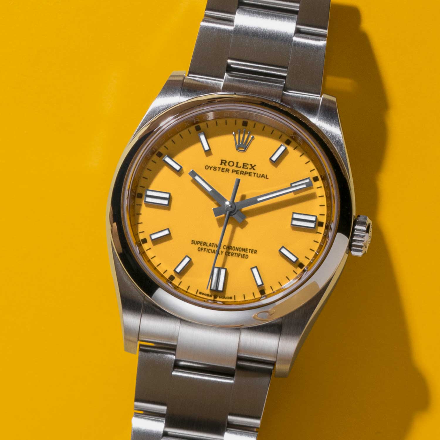
An “agreeable impression” is largely what Rolex received when on September 1st, the brand introduced to the world their 2020 collections, including the Oyster Perpetual 36 in five intensely eye-catching new dial colours: candy pink, turquoise blue, coral red, green and yellow. Just as impressionable as the buzzworthy lacquered dials, however, is the movement within each of the new vibrant-dialed watches: Rolex’s new in-house calibre 3230, which is also the same movement being used in the new versions of the 41mm Oyster Perpetual, and the new 41mm no-date Submariner.
Fresh, brightly tinted dials and a new in-house movement offering 70 hours of power reserve? Colour us five shades of happy.
“Orange is the happiest colour.”
– Frank Sinatra
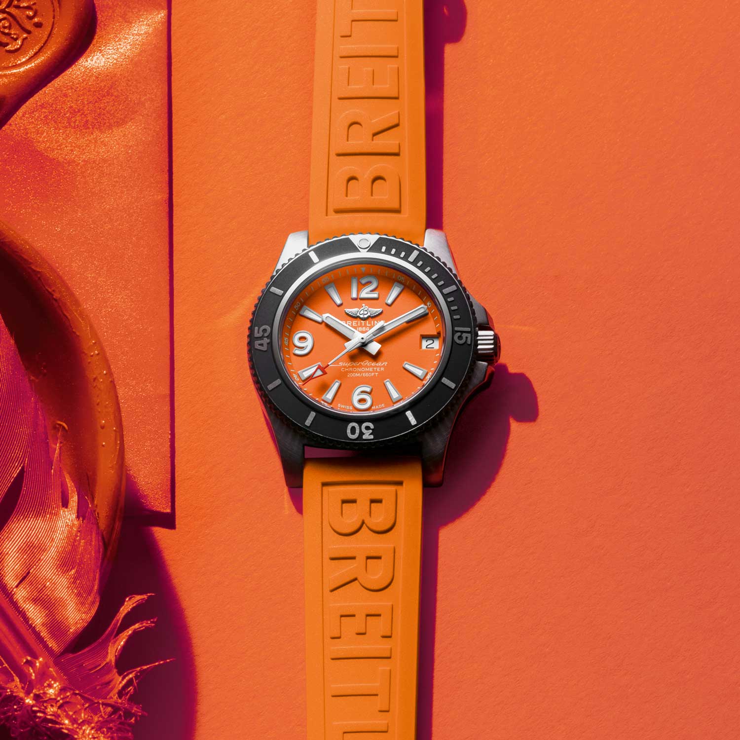 When asked about the brand’s latest colourful watch releases and new, vibrant dials, Breitling CEO Georges Kern responded with enthusiasm: “This is a perfect time for colourful watches. They look great and are definitely mood lifters!”
Since taking over the helm in 2017, Kern has made it clear that Breitling’s outlook for the future is one of positivity and equality, with offerings such as the very wearable Superocean Automatic 36 designed with women watch enthusiasts in mind. And by introducing dial colours — and in some cases, strap colours — in hues such as blue, white, and bright orange (a colour said to promote feelings of vitality, compassion and creativity), the brand continues to make its mark and have its day in the proverbial sun.
“Red is the ultimate cure for sadness.”
– Bill Blass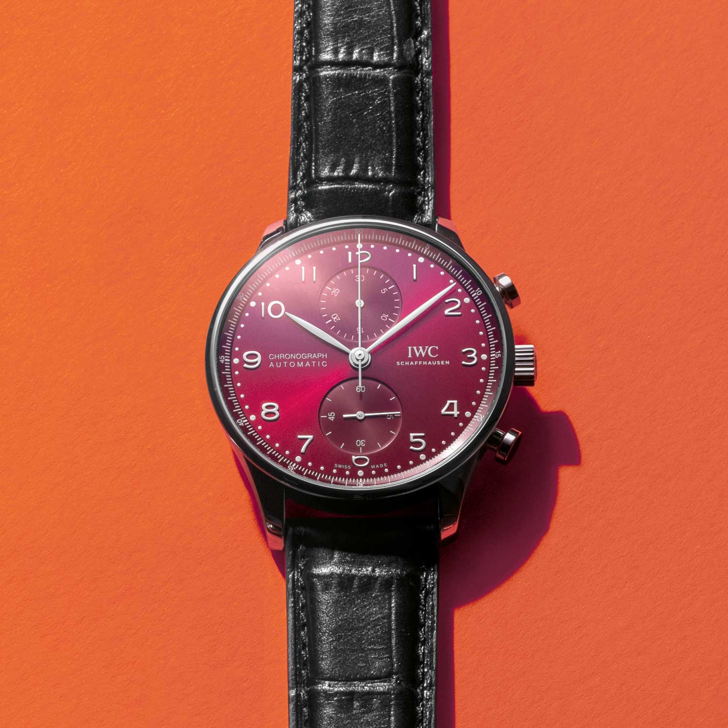 While technically this particular colour of the new IWC Portugieser Chronographs is labeled as “burgundy,” the watch’s sunburst dial effect tricks the eye into thinking it’s also seeing red — at least, in certain lighting conditions. This visual characteristic organically evokes heavier, more intense breathing and even heightened blood circulation for those who set their eyes upon it (although the fact that the new reference 3716 now includes the in-house calibre 69355 may also have something to do with the quickened pulse rate).
At 41mm in diameter, the burgundy version of the Portugieser Chronograph is as gender-neutral as the colour red itself. And like the crimson hue on the face of this release, the watch attracts positive attention without really putting forth much effort. Red is the colour of love, power and youthfulness: three thrill-inducing ideals to constantly covet and of which there is never enough in any one lifetime.
“Green strongly influences the heart and helps alleviate tension.”
– Dr. Tae Yun Kim
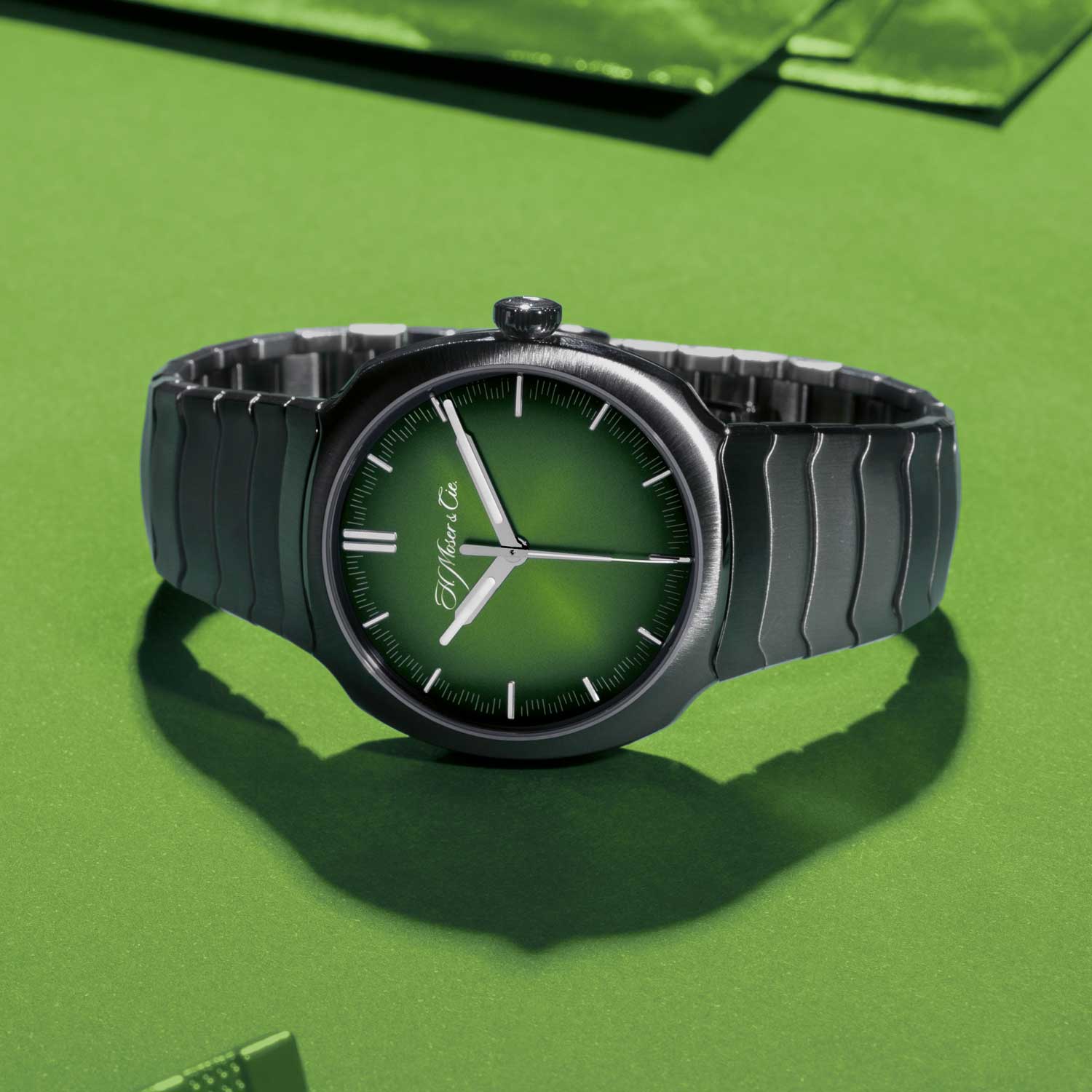 Independent watch brand H. Moser & Cie has a reputation throughout the horological community as a brand that, while wholeheartedly committed to fine watchmaking, never truly takes itself too seriously. The company and its CEO — Edouard Meylan — seem to effortlessly make David Blaine-level magic happen, no matter what they create, and this year’s Streamliner Centre Seconds release with its funky fresh “Matrix Green” dial and integrated snakelike bracelet was no exception.
“The success of the [Streamliner Centre Seconds] is not due to the green colour, but rather to the fact that this particular colour is alive. It varies from gold to olive through a large spectrum of shades of green,” says Meylan, when asked about the public’s positive reaction to the dial’s unique green colour. “Green is the colour of nature; a color of hope,” he adds. “I guess everyone is looking for hope right now.”
“Blue colour is everlastingly appointed by the deity to be a source of delight.”
– John Ruskin
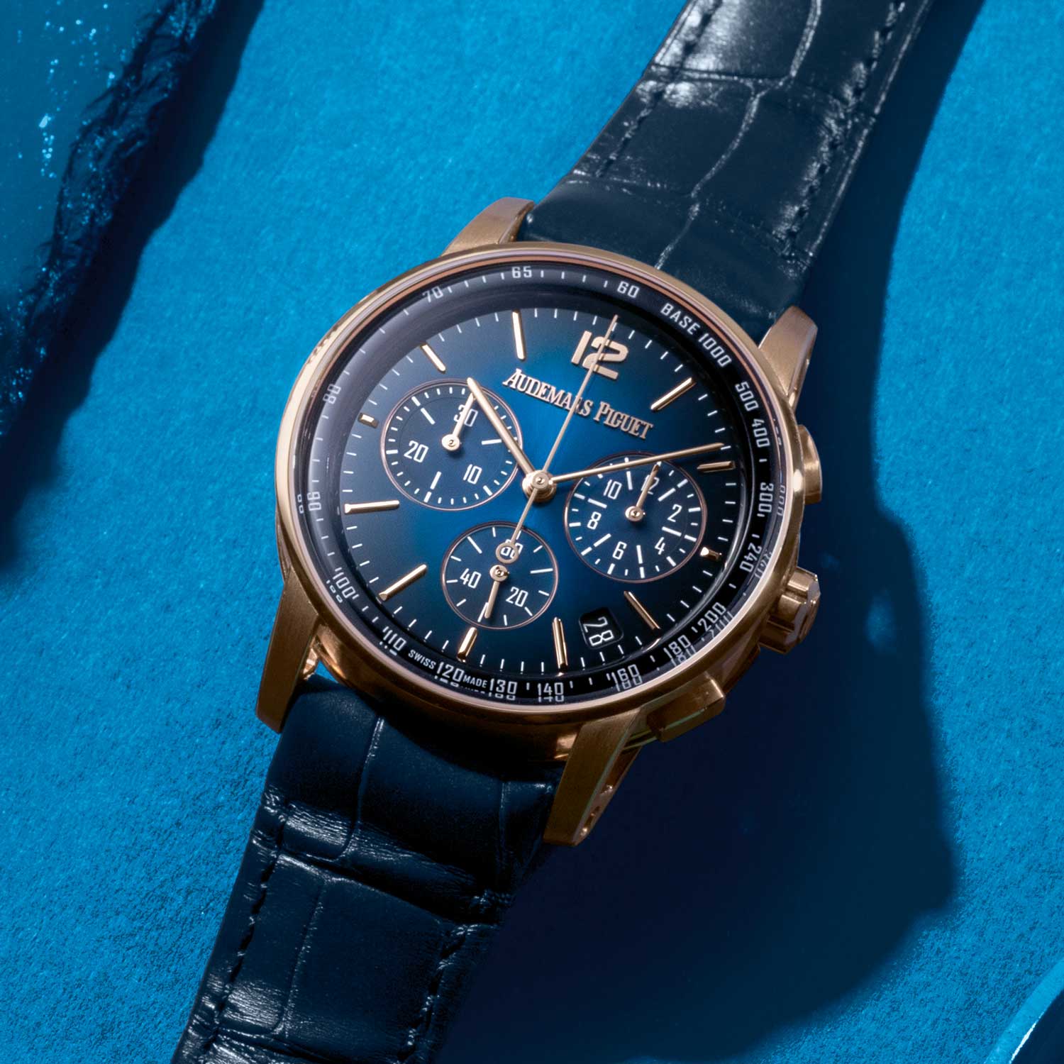 It can be agreed upon that there is no shortage of watches with blue dials presently available for purchase, and with good reason. Blue is an extremely popular colour known to elicit vibes of calmness and relaxation; a colour capable of invoking a feeling of serenity and of trust and security. A pale blue sky and a dark blue ocean can equally quell a nervous onlooker while reminding them to pause time just long enough to take in their own surroundings and allow themselves to breathe.
The new CODE 11.59 Selfwinding Chronograph by Audemars Piguet was introduced this past summer in five new colours, including a pink-gold edition with a smoked blue lacquered sunburst dial and matching blue alligator strap. While there may be numerous blue-dialed watches out there, there is only one that has the look of the CODE 11.59 and only one that is manufactured with Audemars Piguet’s in-house calibre 4302; an automatic movement with seconds and instant-jump date indications.
“Purple puts us in touch with the part of ourselves that is regal.”
– Byllye Avery
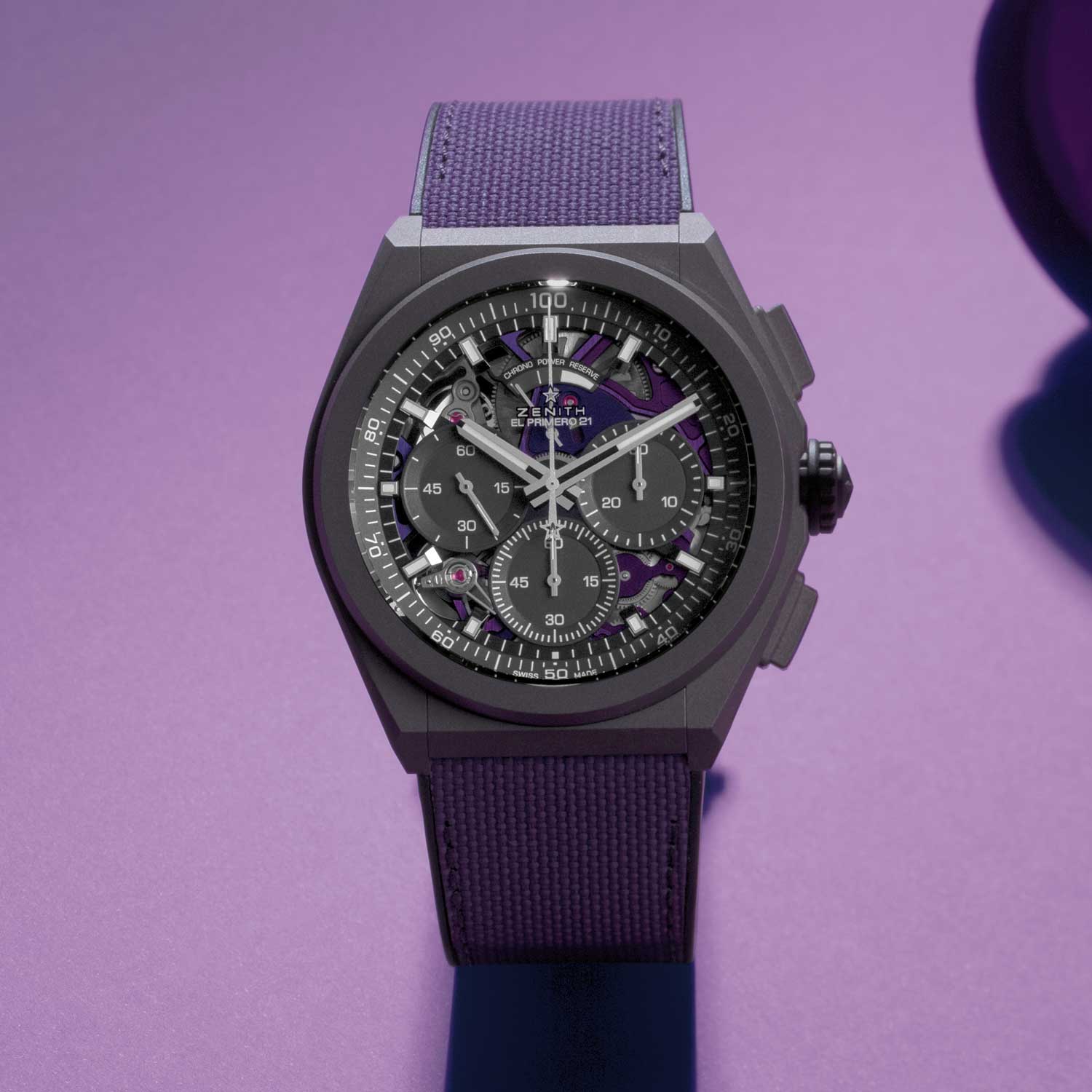 It’s somewhat fitting that a watch brand whose name, by definition, means “the time at which something is the most powerful or successful” would introduce a watch in a colour often associated with royalty, leadership, and wealth. Presenting said watch in a year when so many feel disconnected from those particular characteristics took a fair amount of guts, but it also took forethought, and a belief that things are eventually going to get better for us all. Romain Marietta, head of product at Zenith, feels similarly. “In colour psychology, purple is generally a royal colour and is associated with power, luxury, wisdom, sensuality, imagination, and creativity. It can make us feel very optimistic and hopeful. This is probably why our Defy 21 Ultraviolet has been so successful. It inspires us to dream.”
The Defy 21 Ultraviolet takes “royal highness” to a different level, one that involves light frequency (on the visible spectrum with regard to the colour violet, the hue with the strongest electromagnetic wavelength) and speed, as it pertains to the watch’s dual escapement (at 5Hz and an incredibly fast 50Hz). The combination of the two in a microblasted titanium case make for a powerfully perfect and handsome timepiece worthy of our inner monarch.
“Without the rain, there would be no rainbow.”
– Gilbert K. Chesterton
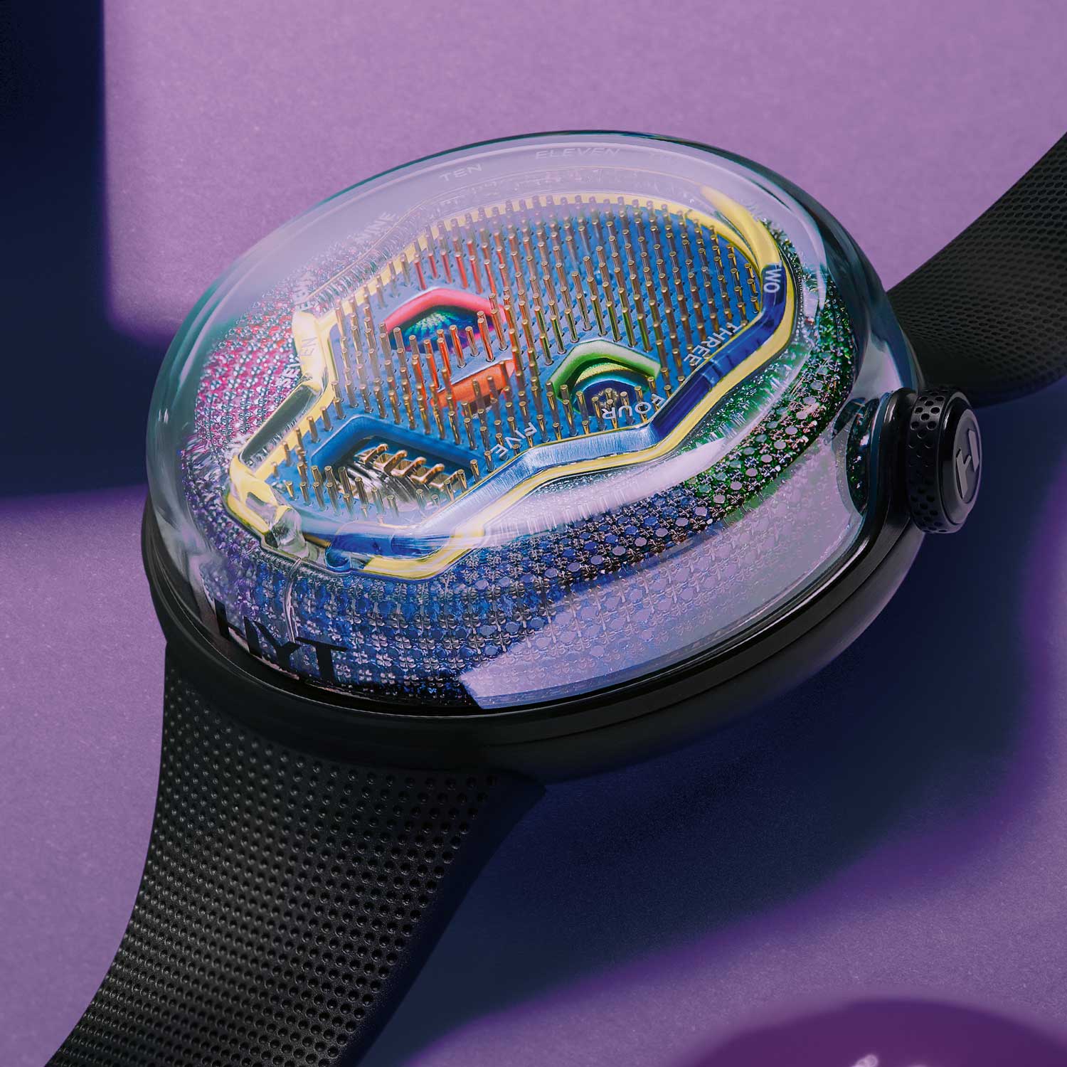 The symbol of the skull has been a common fixture in watch design for quite a while now, and not because the horological world has some morbid obsession with the afterlife. On the contrary, it is the time that we have on this earth, and the reminder that life is precious and worth every minute we spend living it, that often appeals to watchmakers and designers. The skull in some cultures is seen as the celebration of life, and in the case of the latest HYT SOONOW watch, that celebratory symbol is made even more vivacious when surrounded by the colours of the rainbow.
“Colour is the result of the reflection of light. Without light, colour doesn’t exist,” says HYT’s CEO (and occasional in-house philosopher) Grégory Dourde. “Time is similar in a way. It’s defined by what we — or our circumstances — do with it. Time and light perform their intrinsic magic around the clock. And time is never the exactly the same colour twice.”
HYT’s SOONOW Instant Rainbow takes the psychology of colour to an entirely different level by intertwining the emotions that each of the colours of the rainbow evokes with the feeling one gets when contemplating their own mortality. But it does so using the brand’s patented liquid that shows the wearer how much time in the day has passed, and what is still to come.
Colour psychology is defined as “the study of hues as a determinant of human behavior.” Colour affects everything from moods and emotions, to how foods are perceived as to taste, and to a person’s desires and what they find sexually stimulating or sensually appealing. And yet, while associations to specific colours may differ between religions or cultures, it is believed that most genders and races view the various hues in similar ways.
The watch industry — possibly without even realising it — provided enthusiasts, collectors, and novices alike with much needed positivity in 2020 by opening their imaginary crayon boxes and forgetting that they were supposed to colour within the lines. Seeing so many vibrant dials was a refreshing and much-needed change in an era filled with so many shades of grey.
You may also like
News
Breitling Honours Eddy Merckx With A B01 Top Time
Jul 1, 2026
News
Breitling Honours Eddy Merckx With A B01 Top Time
Jul 1, 2026

Editorial
Rolex Celebrates 100 Years of the Oyster Case in Shanghai
Jun 9, 2026
Editorial
Rolex Celebrates 100 Years of the Oyster Case in Shanghai
Jun 9, 2026
Reviews
A Closer Look: Rolex Oyster Perpetual Yacht-Master II
Jun 2, 2026
Reviews
A Closer Look: Rolex Oyster Perpetual Yacht-Master II
Jun 2, 2026