


Through the Looking Glass: Tinted Sapphires
Through the Looking Glass: Tinted Sapphires
The 2025 edition of Watches & Wonders offered a quieter kind of impact — less about spectacle, more about subtlety and finesse. Within this more considered atmosphere, a few quiet shifts emerged, and among the most intriguing was the growing presence of translucent, tinted dials.
Colored dials have been a mainstay over the past few years, with bold party shades and breezy pastels showing up across all price points. But in 2025, some brands are taking it a step further by blending color with transparency.
We’re seeing sapphire dials that aren’t just see-through but softly tinted, adding visual depth without drawing too much attention. It’s a more restrained, almost understated approach that feels quite different from the louder, more technical skeletonised designs of the past, which can sometimes feel too classical or just a bit self-serious for today’s more relaxed aesthetic. From Bell & Ross to Patek Philippe, this direction is quietly picking up momentum in 2025.
Although, it’s not an entirely new idea. Patek Philippe’s Ref. 5180/1G featured a blue sapphire dial as far back as 2008. F.P. Journe followed with its smoky, grey-tinted sapphire on the Vagabondage II a year later. And in 2013, A. Lange & Söhne introduced what would become its signature “Lumen” series, beginning with the Grand Lange 1. So yes, there’s a precedent.

The Datograph Perpetual Tourbillon Honeygold “Lumen” from last year
But something feels different this year. More playful. More considered. As brands grow more comfortable embracing colour and contemporary materials, tinted transparency is being used not just to show off mechanics, but to set a tone, a mood.
A new mood
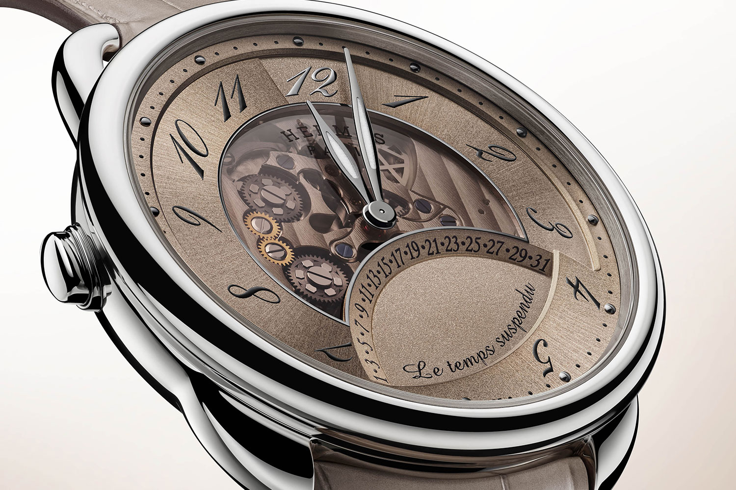
Take the Hermès Arceau Le Temps Suspendu, for instance. First released in 2011 — and a GPHG winner that year — the watch was already known for its whimsical complication: a button that pauses time by freezing the hands, while the movement ticks on in secret.
For 2025, Hermès has taken it a step further. The centre of the dial is cut away and replaced with coloured sapphire, offering a subtle glimpse of the mechanical poetry beneath. It comes in three tones, each paired with a matching strap: muted blue, dark burgundy, and sandy beige. The colours are restrained, never loud — exactly what you’d expect from a designer brand. This careful balance prevents the transparency from feeling gimmicky, a common pitfall for many watches with see-through dials.
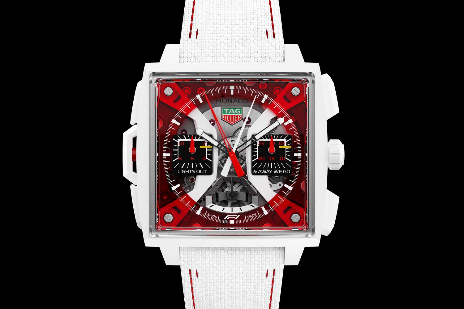
Another standout with coloured sapphire is the TAG Heuer Monaco Split-Seconds Chronograph F1, one of the brand’s flagship models, developed under the guidance of Movements Director Carole Forrestier-Kasapi, who was also the original inventor of the Ulysse Nardin Freak mechanism. In this latest edition, TAG Heuer boldly combines white ceramic with a red sapphire dial, creating a clean, striking look that’s sporty yet sophisticated. It’s a nod to the vibrant, bold colours TAG Heuer embraced in the 1970s, but now reimagined with the materials and technology of today’s era.
Even for high complications
As F.P. Journe and A. Lange & Söhne have shown before, tinted sapphire works especially well on calendar and digital-style displays. It reveals the underlying discs of numerals and letters in a way that feels high-tech, orderly, and surprisingly elegant. Compared to time-only watches — where a see-through dial can sometimes expose a messy sprawl of movement parts — the effect here is much more deliberate. And at this year’s fair, two standout perpetual calendars took that idea and ran with it.
First up is the Patek Philippe Retrograde Perpetual Calendar Ref. 6159G. The retrograde perpetual calendar has long been one of Patek Philippe’s best-kept secrets, often overshadowed by crowd favourites like the salmon-dial ref. 5320G or the Nautilus Perpetual Calendar ref. 5740. But the retrograde indicators offer something distinctly cool, and the display layout feels refreshingly different from the typical multi-subdial perpetuals you often see. It’s nice, then, that Patek has given this model a makeover with a grey sapphire dial, which is an unexpected choice from such a traditional brand.

If I had to pick a personal favourite among this year’s tinted sapphire releases, it would be the Panerai Luminor Perpetual Calendar GMT Platinumtech. A decade ago, it would’ve been hard to imagine Panerai venturing into ultra-luxury territory with a platinum perpetual calendar, but here we are. The movement isn’t brand new — it debuted a few years back — but it’s clever and often overlooked, likely because it’s housed in a dive watch format more associated with time-only pieces.
What sets it apart is the layout. Instead of the usual cluttered subdials, the Panerai features an in-line day and date display on the front, with the month and leap year indicators neatly tucked onto the caseback — all adjustable via a single crown. There’s also a subtle 12-hour GMT hand that hides beneath the main hour hand when not in use, and a day-night indicator integrated into the small seconds subdial. It’s a smart, user-friendly setup that preserves Panerai’s minimalist aesthetic while offering far better readability than most traditional perpetual calendars.
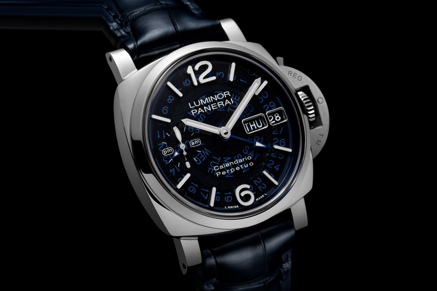
This year, the brand added a blue tinted sapphire dial, and it’s finally getting a bit more attention. The day and date discs circle the entire dial, rather than sitting in small cutouts like those on the Patek. That gives it a much bolder and more modern look. The blue tint is just right — enough to cast a cool tone over the white numerals beneath, adding a bit of mystery and flair.
Something more accessible
All of the watches above sit at the high end, but for those looking for something more attainable, Bell & Ross offers a compelling alternative. The BR 03 now comes in a smoked sapphire variant, paired with a black ceramic case. The all-black design feels sharp and cohesive, but the real interest lies in the dial. The tinted transparency gives just enough of a glimpse into the movement to keep things intriguing, without overwhelming the overall look.
It may sound simple on paper, but the ceramic and sapphire combo stands out at this price point. There’s really nothing else quite like it in this segment.

You may also like
Editorial
TAG Heuer Hearts Australia
Jan 6, 2026
Editorial
TAG Heuer Hearts Australia
Jan 6, 2026
Editorial
Holiday Horology: Something Old, Something New, Something Special — Jola Chudy, Revolution Arabia Editor-in-Chief
Dec 17, 2025
Editorial
Holiday Horology: Something Old, Something New, Something Special — Jola Chudy, Revolution Arabia Editor-in-Chief
Dec 17, 2025
Editorial
Holiday Horology: Something Old, Something New, Something Special — Cheryl Chia, Technical Editor
Dec 17, 2025
Editorial
Holiday Horology: Something Old, Something New, Something Special — Cheryl Chia, Technical Editor
Dec 17, 2025