The Watch Face: Gilt Dials
Reference
The Watch Face: Gilt Dials
“When I use a word… it means just what I choose it to mean — neither more nor less.” (Lewis Carroll, Alice Through the Looking Glass, 1872)
The terminology that we use in watch collecting can be confusing and obscure, our cases contain no luggage, our barrels no beer and our crown cannot grace the head of a king, but within our hobby, we all know what we mean. Some terms are highly misleading and can cause problems if taken literally and a classic example is the ‘gilt’ dial. Gilt, according to the dictionary is a word that dates from the 14th Century, from the same root as gilding, and refers to coating something with a thin layer of gold, or something that appears to be gold. From this one might reasonably deduce that a gilt dial is a gold-plated dial, but in the contrarian world of watch collecting, Rolex aficionados, and subsequently many other commentators, have decided that it means something very different.
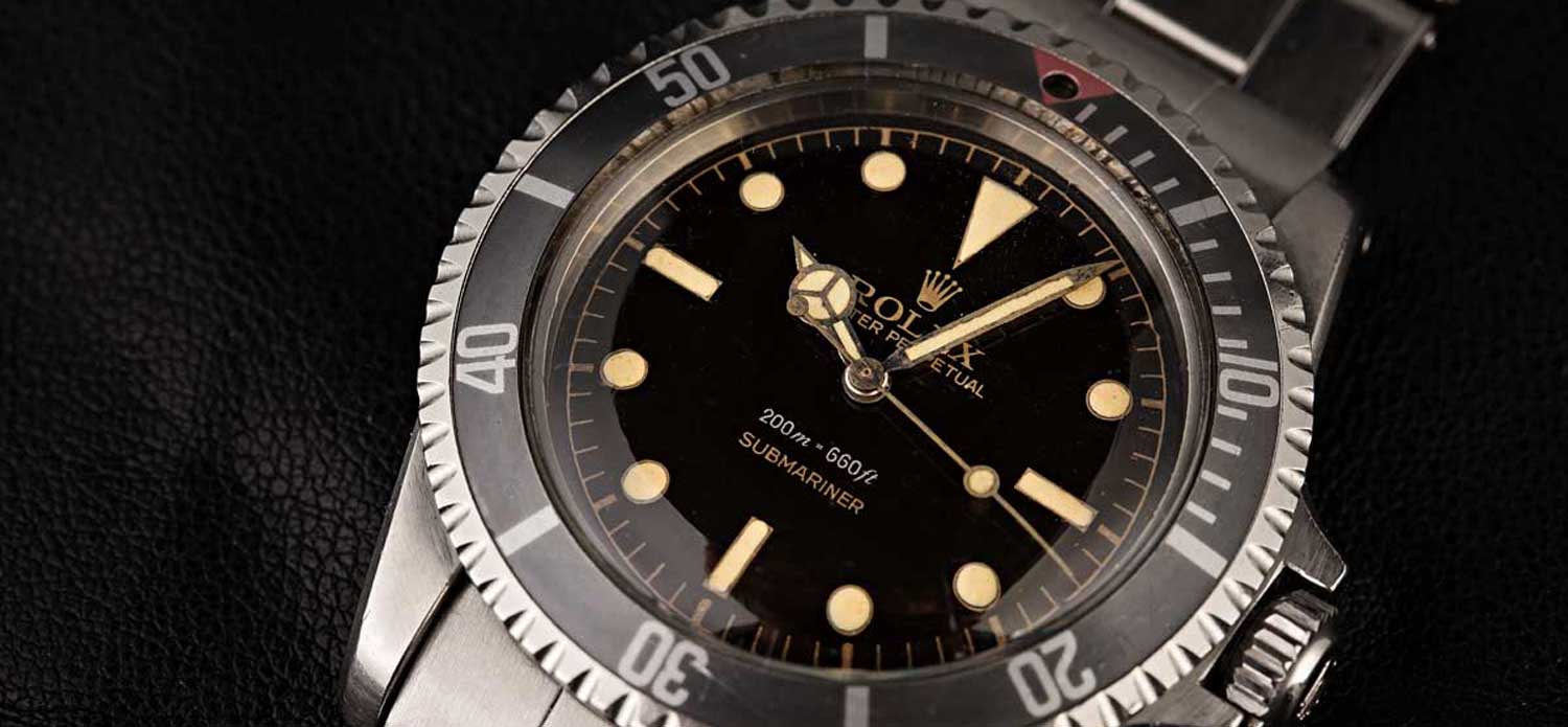
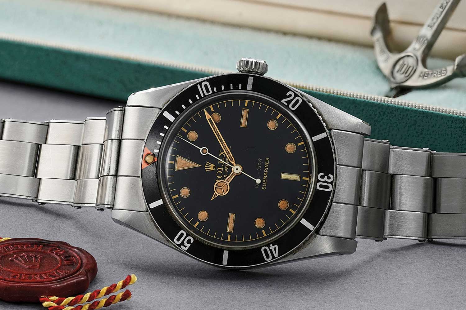
In the 1950s and early 1960s Rolex used gilt dials for their sports models. Here the word is being used by collectors to describe dial which had a gold tone chapter ring and lettering. I am being very specific in my use of words here and not saying gold printing, as is done in many online forum posts and you might infer from the definition of the word gilt. This is not gold lettering that has been applied or gold indices printed onto the edge of the dial but a much more involved and time-consuming process that is by no means limited to Rolex.
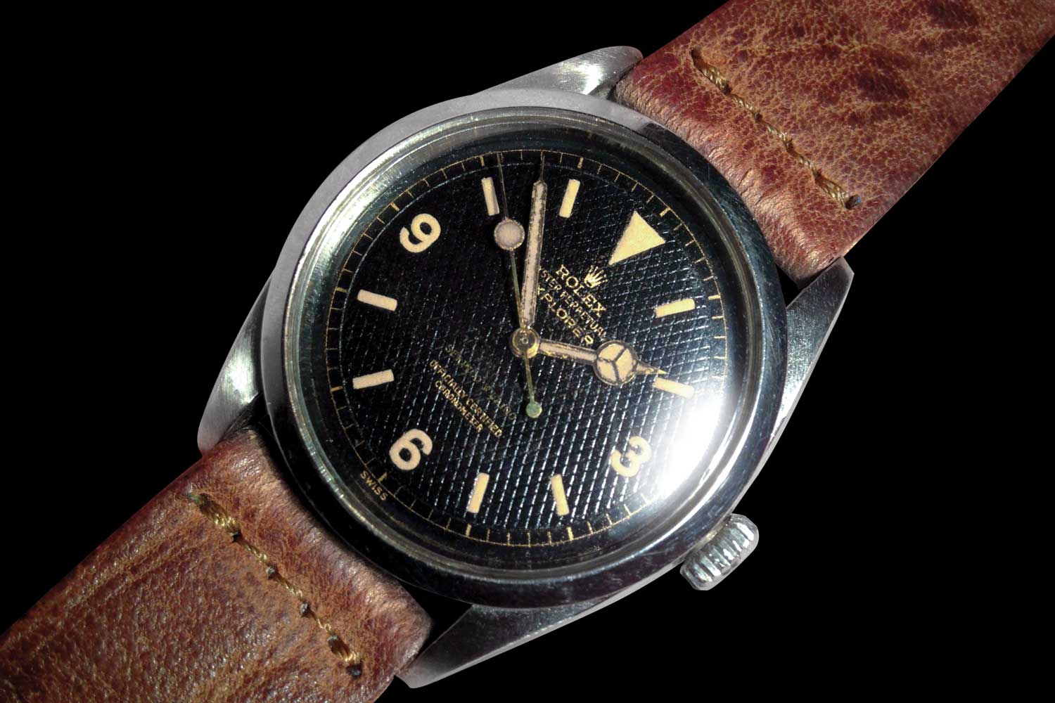 The important point is that the gold colour on a gilt dial is not ink, but the underlying metal, revealed in negative relief. That is not to say other dial details might not be printed by conventional means, in any colour including gold. Rolex printed some depth designations in white or red as well as ‘Superlative Chronometer Officially Certified’ in white, depending on the model.
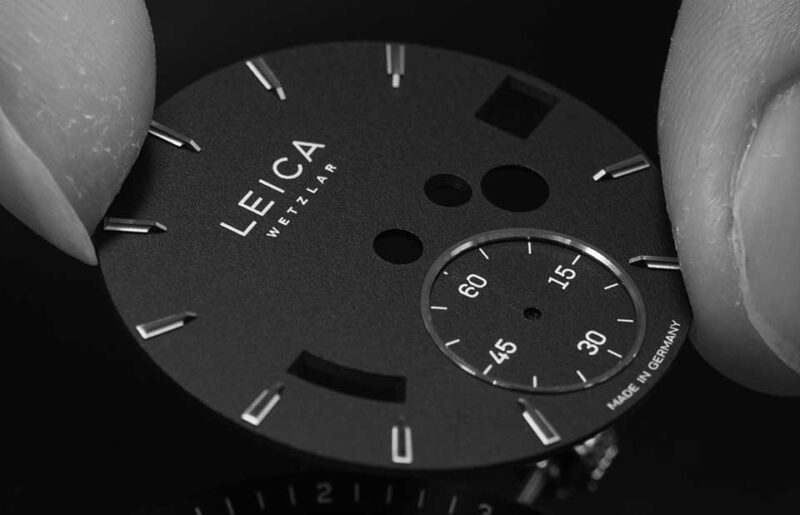
The starting point is a blank brass dial, which is then polished to a mirror finish. The dial can be gold, silver or copper plated, or simply used as is. (Not all ‘gilt’ dials are gold, another layer of confusion as we now find ourselves describing a manufacturing process rather than a color). The required design, whether a simple brand logo, name and model, or a full-on three register chronograph with central spiral tachymeter scale, is pad printed onto the plate. This is done in a soluble, non-conductive ink. The dial is then coated with its base colour, usually in a galvanic tank in an electrical process similar to gold plating (another confusing red-herring, sorry…). The colour is most commonly black, but it doesn’t have to be, the same process can be used to create any coloured dial. To reveal the dial design the plate is ‘washed’, removing the soluble ink and allowing the bare metal to shine through. The process can be repeated if further layers of colour are desired for the final design. The last step is to apply a clear lacquer coating to preserve the metallic sheen of the exposed metal.
The charm of these dials is that the bare metal reflects the light in a way that metallic ink cannot match. There is a warmth and glow to the text and indices that must have been a striking contrast against a pitch-black dial when the watches were new, but which also suited a more mellow, aged black perfectly. As light plays across a gilt dial, the tone of the lettering can change from almost white to a deep bronze effect. So long as the lacquer layer remains intact, the underlying metal will not corrode and discolour, meaning that an old dial, on which traditional printing might have faded, can seem unnaturally vibrant and well preserved. There is a delightful feeling of permanence to dial details that appear to have been chiselled out of the surface, and it is true to say that when being cleaned or restored such details are far less susceptible to being damaged or erased than those of a conventionally printed dial.
 There is a trade-off with this method, when compared to traditional printing. When examined under a loupe, the edges of the lettering or numerals can seem a little fuzzy in a way that high-quality ink printing does not. This is not only part of the attraction of a gilt dial but also a useful clue in spotting a copy. Such a labour-intensive process is hard, although not impossible, for a counterfeiter to master and an easy short-cut would be to use traditional pad-printing in gold on black. While you have your loupe in hand, another detail to note is the ‘step-down’ from the main dial colour to that of the lettering, a clear indication that the dial has been produced with the ‘mask-and-reveal’ method.
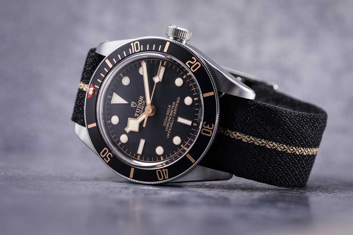
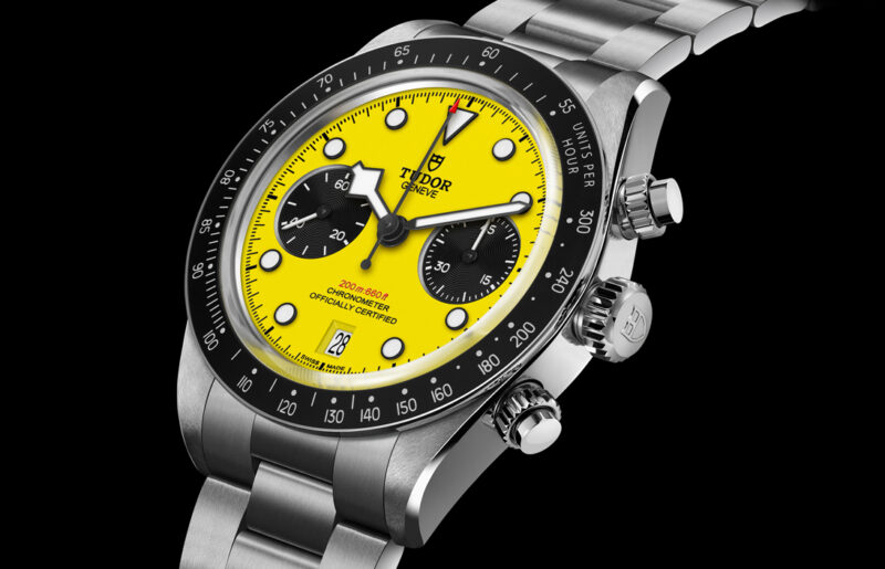
Although used from the late 1930s through to the late 1960s, gilt dial production seems to have fallen out of favour since. Increased production numbers and pressure on production costs have consigned such convoluted practices to history. Gold on black is still a popular dial colourway, especially if, in the case of the Tudor Black Bay, a vintage vibe is what is required, but a close examination of the lettering shows that this is just surface applied ink. Maybe this is the final aspect of the appeal of a gilt dial, it says ‘vintage’ so eloquently in that it harks back to a period when more time and effort could be taken, even for relatively inexpensive watches. In comparison, modern dial decoration is, both literally and figuratively, more superficial.
You may also like
Editorial
Tudor Calls Collect
Jun 23, 2026
Editorial
Tudor Calls Collect
Jun 23, 2026

Editorial
Rolex Celebrates 100 Years of the Oyster Case in Shanghai
Jun 9, 2026
Editorial
Rolex Celebrates 100 Years of the Oyster Case in Shanghai
Jun 9, 2026
Editorial
Tudor Introduces the Black Bay Chrono 39 “Bumblebee”
Jun 4, 2026
Editorial
Tudor Introduces the Black Bay Chrono 39 “Bumblebee”
Jun 4, 2026