
Harmonic Display — The 2016 Harmony Timepieces Of Vacheron Constantin
A brand like Vacheron Constantin is not a brand that one loves lightly, because it kinda demands that level of immersion and sympathy with its blend of heritage and modern values. Don’t come to Vacheron Constantin expecting Instagram-perfect lifestyles, high-octane celebrity endorsements or collaborations with televised sports — you’re wasting your time. A connection with Vacheron Constantin means a deeper affinity, a truer harmony. (I hope you see what I did there.)
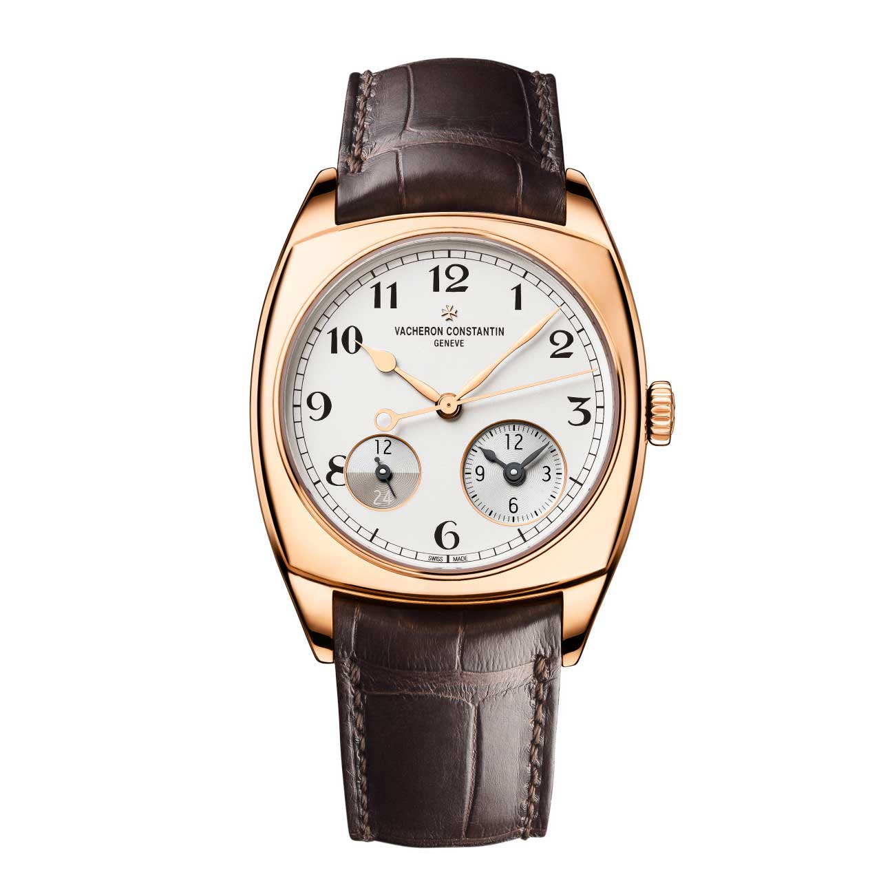
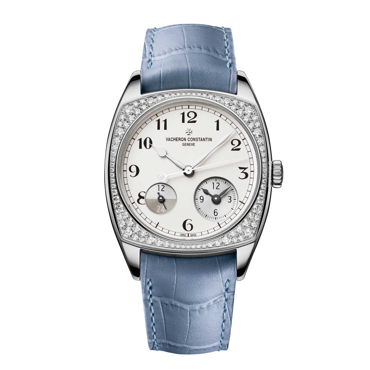
Looking at the Vacheron Constantin collection for the first time, you might be forgiven for getting a little glassy eyed — it’s true that purely in terms of design outline, they tend towards the classic end of the spectrum. Round watches, tonneau watches, cushion-shaped watches, yes okay fine. But just spend a little more effort getting close to these watches and there is literally no upper limit to the sensate gratification you get in return.
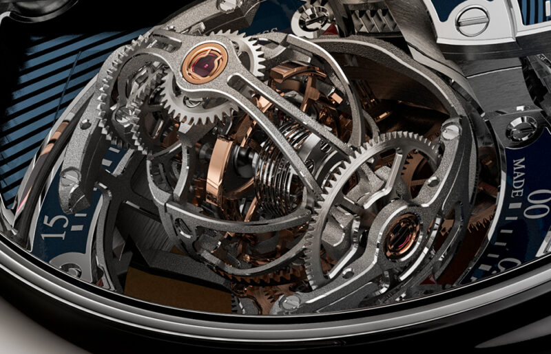
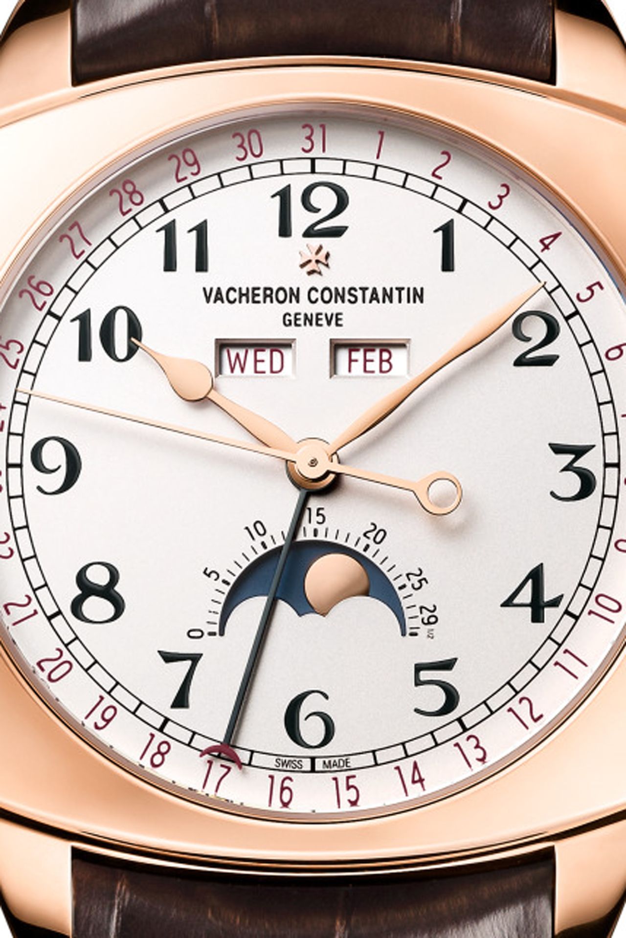
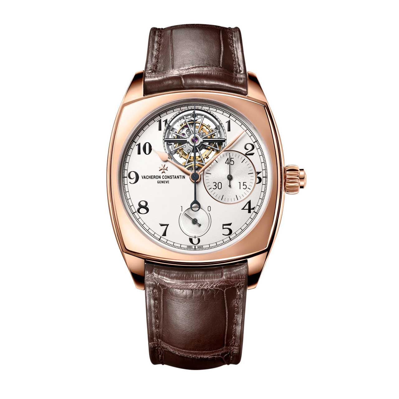
The new Harmony Complete Calendar reintroduces to the Vacheron Constantin repertoire a vintage-inflected display, better known to collectors as the “triple date”, that’s been missing from the collection for a while. The other complications (chronograph, tourbillon chronograph, rattrapante chronograph, dual time) had dials that were tirelessly finessed until they achieved the optimal balance of classicism and modernity. Having firmly established the collection in the 21st century, however, the Complete Calendar is pretty confident in taking us back a handful of decades for its design references.
Of particular interest (to me, because I’m that kind of nerd) is the style of numerals and letters that make up the calendar indications — the date numerals, the age of the moon, the day and the month. These are formed with reference to archival timepieces, whose dials were painted by hand with the aid of stencils, and with regularity and legibility as top priorities. The contrast of san-serif fonts at the secondary level with the curvaceous flair of the hour numerals is nothing short of delicious. (I am prepared to arm wrestle anyone who disagrees. I will so totally lose, but this is how much I care about proving this point.)
In order to help the wearer pick the information out quickly, the date, day and month are further differentiated by a deep burgundy colour. The date hand bears a burgundy crescent at its tip. Not red, but burgundy, to subtly recall the age-related discolouration that pigmented inks undergo — yet another aesthetic nod to the watches of a bygone era.
The case of the Complete Calendar measures 40mm at its narrowest and 49.3mm at its widest, like the Harmony Dual Time, but if you for one second imagine that Vacheron Constantin would cut a few corners in their development process by reusing an existing case, I’m here to tell you that the Complete Calendar is 0.43mm thinner — and you know what that means. With a case as geometrically complex and precisely balanced as the Harmony, each different set of case dimensions requires substantial work to perform at similar aesthetic levels.
You can’t just take one design and stretch (or compress) it along various axes in order to get the size you want. It doesn’t work like that — the result would look frankly painful. Scale and proportion have a non-linear relationship. Mediaeval artists used to do this thing with depictions of children, notably the infant Jesus, and essentially paint them as reduced-scale adults. It looked weird as hell, you guys.
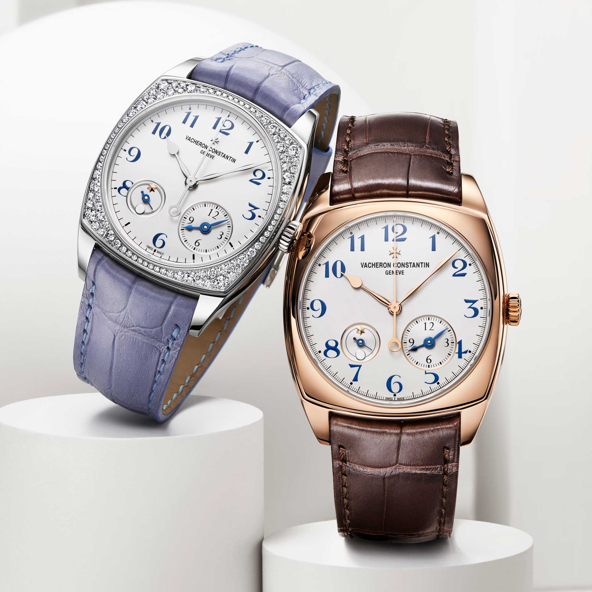
This expansion is pleasing to me for a number of reasons, chief among them that I think it makes perfect sense for the Harmony to be a fully populated collection. In every possible definition of the word, “harmony” is only meaningful in context of a multitude. I mean, think about it. It’s only logical.
You may also like
News
Vacheron Constantin Updates the Twin Beat Perpetual Calendar with a 70-Day Power Reserve
Jun 18, 2026
News
Vacheron Constantin Updates the Twin Beat Perpetual Calendar with a 70-Day Power Reserve
Jun 18, 2026
Editorial
Watches and Wonders 2026 Editor’s Pick: Matthew De Jesus, News Editor
May 3, 2026
Editorial
Watches and Wonders 2026 Editor’s Pick: Matthew De Jesus, News Editor
May 3, 2026
Editorial
Watches and Wonders 2026 Editor’s Pick: Israel Ortega, Revolution Mexico/Latin America Editor-in-Chief
May 3, 2026
Editorial
Watches and Wonders 2026 Editor’s Pick: Israel Ortega, Revolution Mexico/Latin America Editor-in-Chief
May 3, 2026