


Brand-Name Designers and the Watch Trade
The authors of some of our most beautiful and useful objects are unknown. The classic burgundy bottle and the “waiter’s friend” corkscrew needed to unlock its treasure are exquisite examples of anonymous design: unimprovably perfect with nothing needing to be added nor taken away.
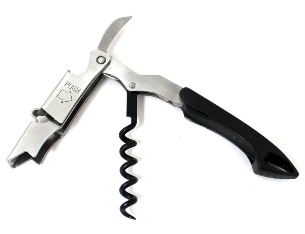
“Waiter’s friend” cockscrew, fittingly named for packing immense utility in a compact design
Essentially, the analogue watch apes the clock face, which itself was established in the 14th century. By about 1700, escapement mechanisms had become sufficiently accurate to make a minute hand a worthwhile accessory. Hitherto, a more approximate hour hand was thought sufficient: perhaps before the modern era no-one rushed very much. After all, the New York Minute – a euphemism for an instant – is a modern invention. Meanwhile, the 12-hour division has become a universal convention (although in revolutionary France there was a flurry of interest in the 10-hour watch).
That we speak of watch “faces” and “hands” suggests how close these familiar machines are to us, almost as if we identify with them as clockwork humanoids. There are other natural influences: the hands move “clockwise” in imitation of a sundial where the gnomon casts its mysterious shadow from left to right as the Eye of Heaven travels its bright arc. This set of formal conventions has produced generic masterpieces. To the vast majority of watches we can attach no designer’s name: a sort of perfection that was a result of Darwinian evolution. But designers are curious, interfering types and a small number has made interventions in watch design, adding their own autograph to anonymity.
Fitting the Bill
Outstanding in this number was Max Bill (1908-1994), a Swiss architect, typographer and designer. Bill painted too and on canvas was committed to an extreme version of Colour Field Abstraction, absolutely denying any reference to nature in his work. Frivolous he was not. Bill’s entire culture – technophiliac, concretised, dogmatic, beautiful – was derived from his education at the German Bauhaus, perhaps the most influential, if least well understood, art school ever.
Swiss architect and designer Max Bill – a Bauhaus graduate – brought the aesthetics of the Ulm School of Design to the watch world when Junghans became one of his clients in the 1950s.
But when the Bauhaus moved from stately Weimar to its own building in Dessau, it became ever more technocratic and disciplined. The Gropius-designed Bauhaus, all-white tectonics and deep shadows, geometry and metal fittings, was the best messenger of Modernism and still provides stirring visual propaganda for several lost causes. Here, art students worked in conditions somewhere between modern factory and secular cathedral, worshipping the machine as exemplar and inspiration.
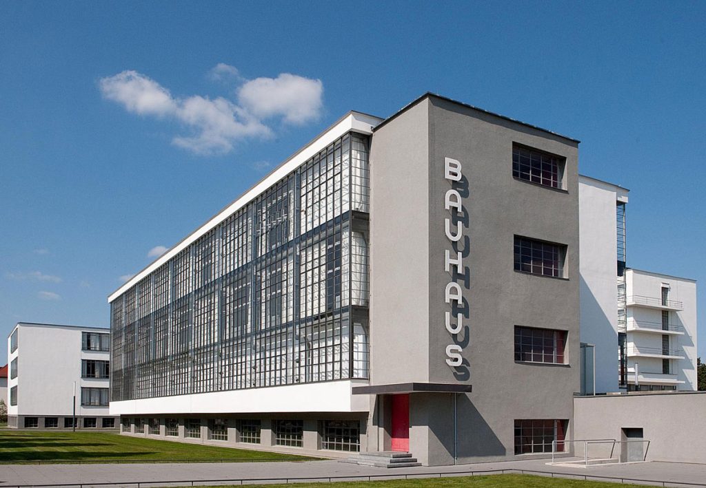
Bauhaus Building by Walter Gropius, Dessau
When the Bauhaus was closed in 1933 by the Nazis – on suspicion of it being a fizzing cell of Jewish-Bolshevik dissent – its director was Ludwig Mies van der Rohe (who had made a forlorn rearguard attempt to sell Modernism to Hitler as the authentic German style). Before Mies and after Gropius, the director had been Hannes Meyer, who believed all of life could be explained in terms of hydrogen and carbon. He proved too austere even for a regime where angle iron was considered a thing of beauty.
Mies, as he was always known, explained: “The Bauhaus was not a school, it was an idea”. And Mies’s ideas included that it was better to be good than to be interesting and that “God is in the details”. Most famously: “Less is more”. All these nostrums were strictly interpreted to mean, in products and buildings: formal geometry with no curves or curlicues; industrial materials and finishes; absolute clarity and an obstinate refusal of decoration. That this all sometimes led to a loss of the very “functionalism” its proponents otherwise advocated was of no matter. Max Bill inhaled. Really rather deeply.
Time and the economic miracle
And Bill had an opportunity to repeat the Bauhaus experiment when, after 1945, Germany was again demoralised and he became the founder, designer and first rector of the Ulm School of Design, a near-facsimile of the Dessau original with as few concessions to frivolity. Here Bill and his colleagues Otl Aicher (who later created the Lufthansa corporate identity) and Tomas Maldonado taught “systematic design”, the belief that design is not an art, but a technical process that can be analyzed, formulated and repeated. Just like a machine. Together, they created the style of Germany’s Wirtschaftswunder.
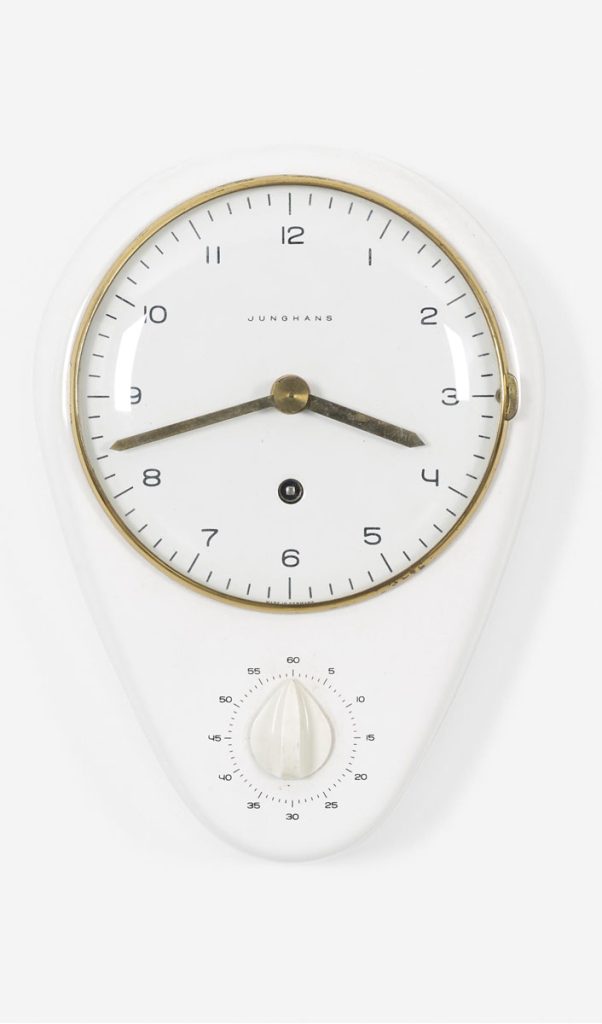
But the School of Design’s contacts with industry were more real-world than the Bauhaus’ polite fictions and Bill accepted private clients along with his teaching duties. One of these was Junghans whose Bill-designed wall-clock of the mid-1950s is an exquisite miniature of German design in all its magnificent high purpose.
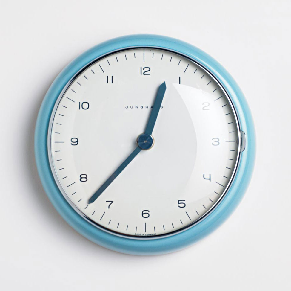
Max Bill for Junghans wall clock from 1954
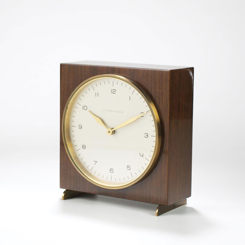
Junghans Max Bill-designed chiming table clock in lacquered wood case
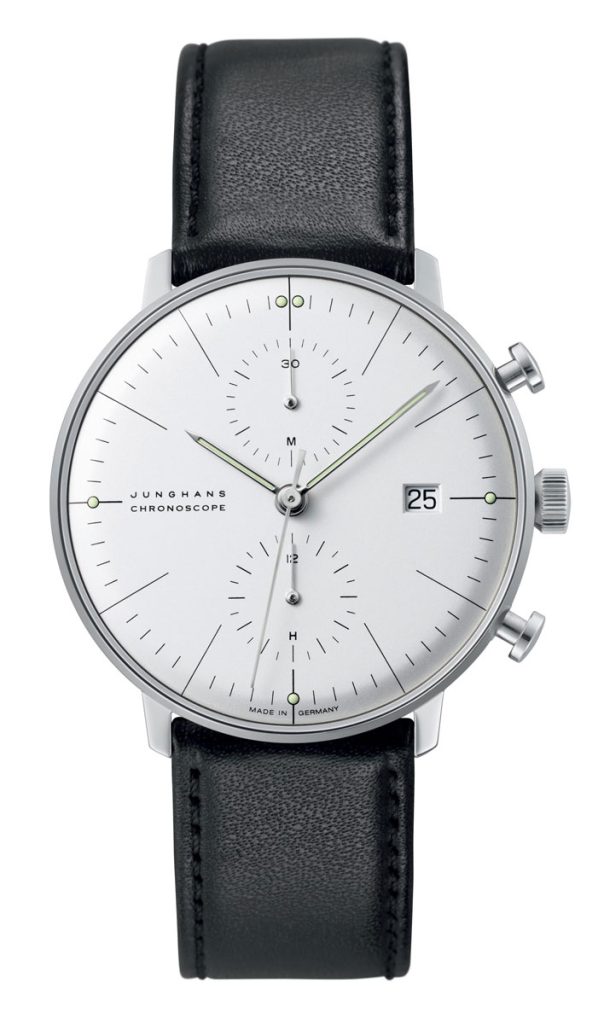
The current Junghans Chronoscope is almost indistinguishable in looks from the 1961 Max Bill original
A kitchen clock designed by Max Bill for Junghans in 1953
Tallon show
A very different watch designer was Frenchman Roger Tallon (1929-2011), foie gras to Bill’s bratwurst, although his work also evolved in a political context. Tallon was France’s pioneering design consultant and, in 1957, the first to teach an undergraduate course on the subject at the Ecole Nationale Supérieure des Arts Décoratifs. To his French savoir faire, Tallon added a good measure of American can-do realism after working for General Electric in the 1960s. Here, he came into contact with the flamboyant Raymond Loewy, whose influence can be seen on the very first TGV-Atlantique, which Tallon designed. Frenchly, he described it as “metal that flows into space”. Later, he became Design Director of Eurostar.
ith an emphasis on ergonomics and comfort, Roger Tallon went on to become Design Director of Eurostar
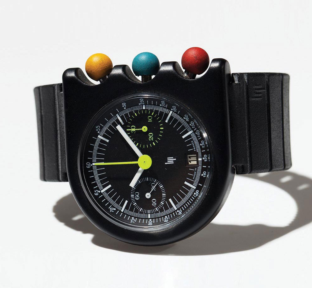
Lip’s Mach 2000 chronograph by Roger Tallon, 1974
In Tallon’s Lip, 1970s style found its expression… at least until an Ulm School of Design graduate called Dieter Rams, one of the last century’s greatest product designers, created the Braun BN series of wristwatches in 1978. Taking a cue from Mies van der Rohe, Rams insisted that his design offered “Weniger, aber besser” (less, but better).

20th-century super-designer Dieter Rams focused on the “less, but better” ideology

Braun BN timepiece DW30 by Dieter Rams, late 1970s
The new Guard
Through his admiration of Rams, Bauhaus principles influenced all of Jonathan Ive’s celebrated work for Apple. Up to and including the Apple Watch, where Ive’s friend, the Australian designer Marc Newson who joined Apple last year, has left his own handwriting. Some details of the Apple Watch, especially around the lugs, are reminiscent of the Ikepod watches Newson began designing for Swiss entrepreneur Oliver Ike after 1993. Newson, whose signature is surfer dude colourways and organic form, is a fully-realised version of what it is to be a 21st-century designer: an example of his limited edition riveted-aluminum Lockheed Lounge chaise longue, celebrity furniture, was sold for £2.4 million in 2015. Meanwhile, Ikepod filed for bankruptcy in 2003.
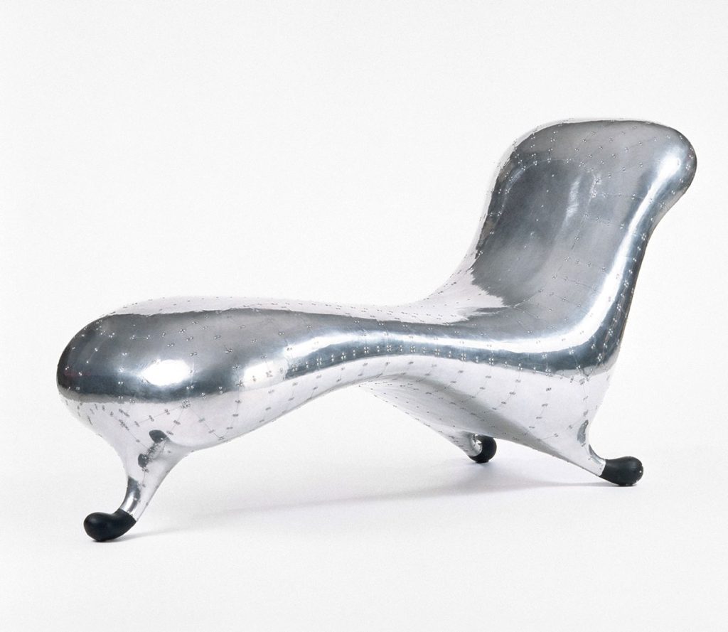
Lockheed Lounge by Marc Newson
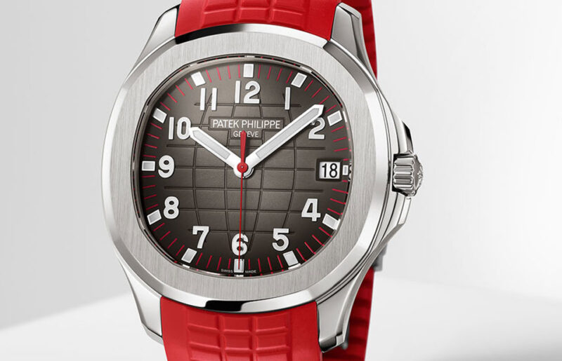
But, as if to prove that Bauhaus rules either in the breach or the observation, there is, as an autograph watch designer, also the example of Gérald Genta (1931-2011). Genta’s is an entirely different design language. Yes, he used explicitly technoid screws on the bezel of the Audemars Piguet Royal Oak, but his sensibilities are based in decoration learnt when craft training as a silversmith, in the glorious redundancy of grand complications or symbolic reference… not on DIN standards. For example, a Patek Philippe Nautilus is shaped like a ship’s porthole while his Bulgari Bulgari, the repetition of the name suggesting excess, was inspired by an ancient Roman coin. Genta’s 1994 Grande Sonnerie Retro has been called “the world’s most complicated wristwatch”. The Bauhaus, of course, fetishized simplicity.
In my dreams, I show a Grande Sonnerie to the ghost of Max Bill and imagine his response. Dogmatic and short. But designers tend to be people of few words…

You may also like
News
These Are The Most Iconic Singapore-Exclusive Timepieces Over The Years, And Then Some
Aug 8, 2025
News
These Are The Most Iconic Singapore-Exclusive Timepieces Over The Years, And Then Some
Aug 8, 2025
News
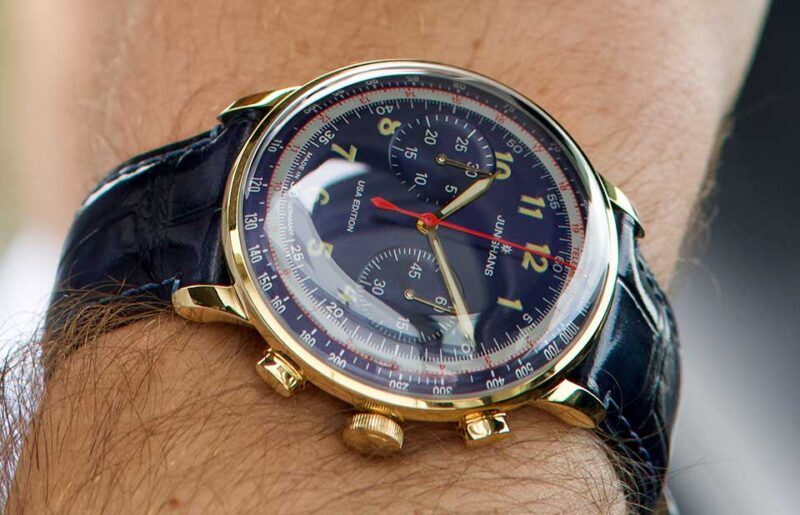
Junghans Telemeter USA Limited Edition: A Thunderclap of Vintage
Jun 3, 2025
News
Junghans Telemeter USA Limited Edition: A Thunderclap of Vintage
Jun 3, 2025

News
Standing the Test of Time: Review of Junghans Meister Pilot Chronoscope
Sep 1, 2023
News
Standing the Test of Time: Review of Junghans Meister Pilot Chronoscope
Sep 1, 2023