News

Frederique Constant Introduces the Slimline Perpetual Calendar Manufacture Designed by Peter Speake

News

Frederique Constant Introduces the Slimline Perpetual Calendar Manufacture Designed by Peter Speake

Share

Frederique Constant continues its strong spate of releases with the Slimline Perpetual Calendar, this time designed by British watchmaking legend, Peter Speake. Once again, the brand succeeds in making a complicated watch user-friendly and urbane.
In watchmaking, timing is everything. The annual release cycle has, for several years now, focused on the major fairs held in Geneva in the spring and the autumn. At the start of April and end of August, the novelties revealed at Watches and Wonders and Geneva Watch Days respectively tend to dominate the headlines for the rest of the year.
However, this results in certain quiet spots in the calendar when a well-timed release has the opportunity to gain traction that it might otherwise struggle to muster were it released during the busier seasons. While January is not typically regarded as a great month for watch sales, it does present just such an opening. This year, on the 18th of the first month specifically, Frederique Constant has capitalized on the lull by announcing a new watch designed by British watchmaking legend, Peter Speake.

Peter Speake

Speake, who might be best known for his association with the brand that still bears his married name (Speake-Marin), has spent the last few years educating a broad audience on the subject of watchmaking via his website, The Naked Watchmaker, another project started with his now ex-wife Daniela Marin. Now, he brings his particular design sensibilities to Frederique Constant with the Slimline Perpetual Calendar Manufacture.

Initial thoughts


Perhaps it should come as no surprise that Speake has brought a tasteful nakedness to the dial of the Frederique Constant Slimline Perpetual Calendar Manufacture. The heavily open-worked display reveals many of the dial side components, all of which are finished to the exacting standards FC demands for a piece of such import. Circular brushing picks out the brass wheels, which seem to glow against the matte maniplate finishing. Straight-grained steel components offer an edgy and aggressive contrast to the warm golden tones of the brass and the refined royal blue of the screws.

Despite the fact there is certainly a lot going on in this design, Speake has brought his trademark legibility to the piece, which aligns with Frederique Constant’s goal to create complicated timepieces that are easy to read. We saw it recently with the Frederique Constant Highlife Tourbillon Perpetual Calendar Manufacture, which artfully minified the visual noise one might expect from such a complication (especially when paired with a tourbillon).


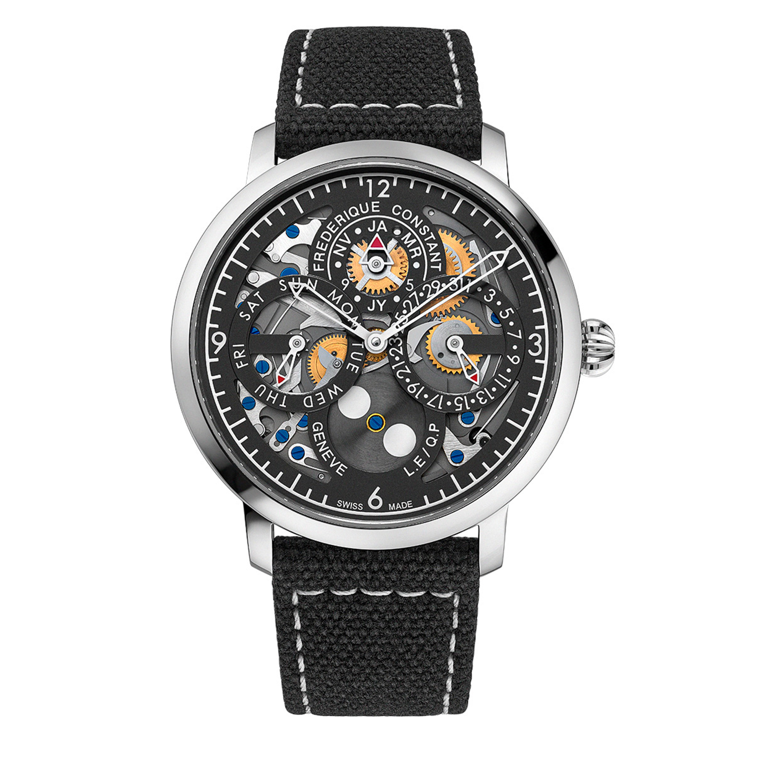
Once more, the clever (and restrained) use of color (or, perhaps more accurately, the lack thereof) has resulted in a design that is extremely easy on the eye. The dark anthracite gray chapter ring that encircles the dial displays the cardinal hours (12, 3, 6, and 9) and minute markers. Each of the watch’s four “sub-dials” is outlined by overlapping chapter rings of their own, with those along the horizontal access slightly proud of those at 12 and 6.

That subtle use of levels helps distinguish the intersecting displays nicely. At 12 o’clock, we can see the brand name (in a simple font that matches the rest of the typography) arched around the outside of the month display. The months are indicated with an unusual mixture of two-letter abbreviations (JA, MR, JY, and NV for January, March, July, and November), dots (representing February, April, June, August, October, and December), and the number “5” and “9” (standing in for May and September). It’s weird and wonderful and I personally love it. It’s a great example of form following function and, given the restricted canvas with which Speake has had to work, it’s a cute solution to something that could have been problematic if he’d allowed it to be.


At 3 o’clock, the date is displayed via a red-tipped hand, whose style recalls the centrally-mounted hour and minute hands. It is mirrored by an identical hand trailing the 9 o’clock sub-dial, where one can pinpoint the day of the week. While the odd dates are indicated by numbers and the even dates by dots, there is plenty of space on the 9 o’clock register for every day of the week to have its own three-letter abbreviation (in English — Mon, Tue, Wed, Thu, Fri, Sat, and Sun).

The coolest work of the date indication? The leap year indication. The dot that represents February is actually an aperture. During years one, two, and three of the leap year cycle, the dot remains white, but during a leap year, it turns red, informing the wearer that there are not only 366 days in the year but also that February — now highlighted — is the month responsible for it. It’s an awesome touch I don’t remember seeing before but will advocate for more widespread usage going forward.

My favorite of the four sub-registers, however, is the one located at six o’clock. Here, we’re treated to a gracefully minimalistic moon phase indicator. I’m a fan of this indication for three aesthetic reasons that I feel make it quite special. Firstly, I applaud its modern styling. The conversation of how the moon phase complication — one of watchmaking’s most anachronistic, esoteric, and, arguably obsolete functions — can ever be deployed unobtrusively in a contemporary fashion is one frequently had in the beer halls of Switzerland, Germany, and anywhere else that cares to concern itself with the minutiae of watch design. The circular graining of the wheel connects it to the visible wheels of the movement and its dark gray color makes it seem almost brutalist.


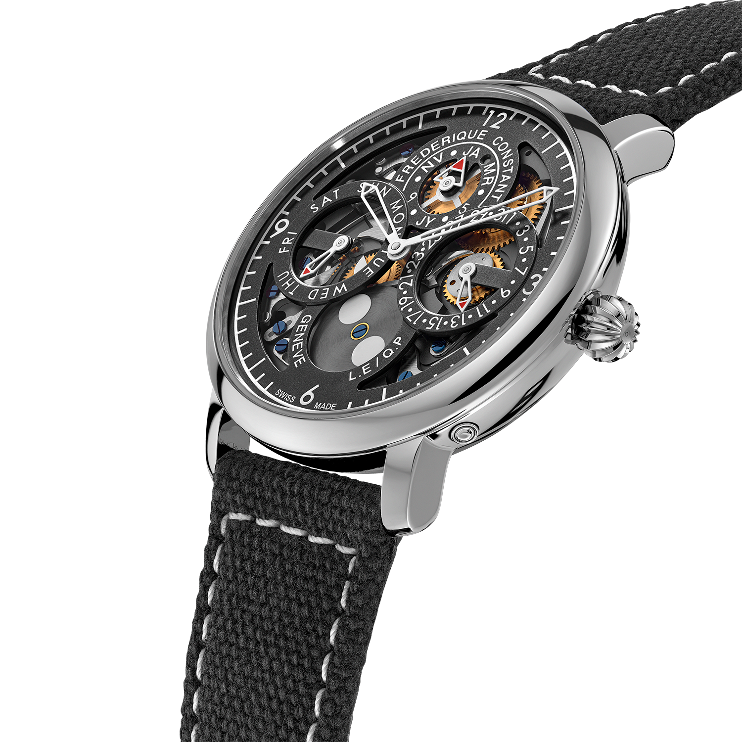
Secondly, I love the integration of blue and gold tones that ties this element of the watch to the rest of its design. Having a heat-blued screw as the center point of the moon phase disc, ringed by a brass flange adds a technical flavor to the display while ensuring it harmonizes chromatically with the rest of the caliber.

Lastly, I’m mightily impressed with the cleanliness of this component and its integration. The moon phase disc sits below the chapter ring (adding another level to the display), which could lead one to assume the wheel’s teeth are simply hidden by the chapter ring itself. That could easily have been the case but the decision to make the six o’clock sub-dial a “broken circle” means that hiding the apparently floating wheel’s teeth wouldn’t be possible. Clearly, then, the teeth are beneath the disc, which is not only elegant but visually satisfying to behold in operation.

Wearable tech


Frederique Constant is very proud (and vocally so) about the wearability of its watches. Even (if not especially) its complicated ones. This Perpetual Calendar measures 42 mm across and just 12.05 mm thick. That second measurement is the key. Once again, FC has succeeded in making a watch that is at once complicated and comfortable, timeless and trendy, easygoing and elegant. Priced just below $12,000, this is also a serious value proposition from a well-known, well-respected maker that is making heavy-hitting horology more accessible as a matter of course.

TECH SPECS


FREDERIQUE CONSTANT SLIMLINE PERPETUAL CALENDAR

Reference: FC-775PS4S6

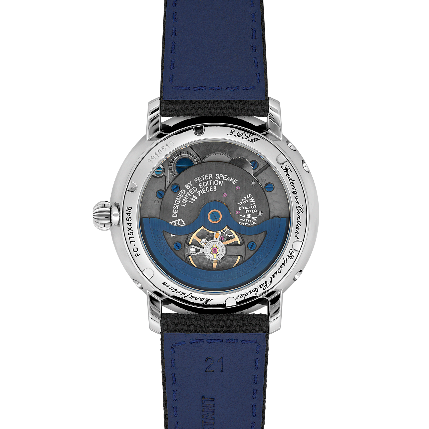
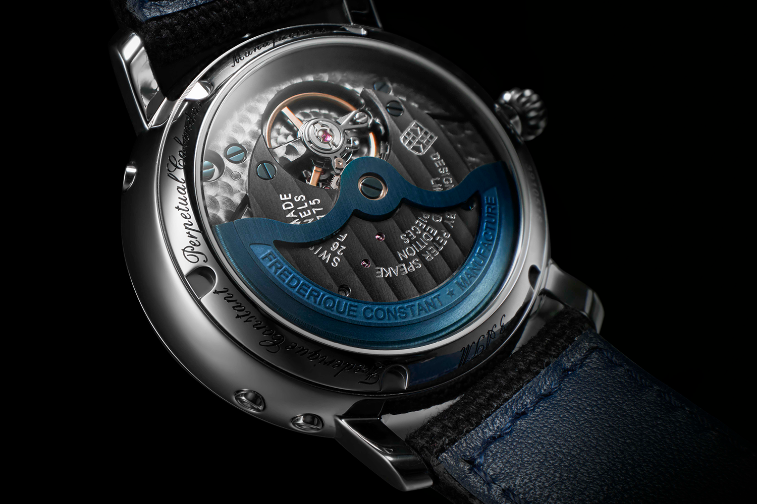
Movement: Manufacture FC-775 in-house automatic caliber, with a perpetual calendar, 26 jewels, a 38-hour power reserve, and an operating frequency of 28,800 vibrations per hour.

Functions: Hours, minutes, moon phase, date, day, month, and leap year

Case: 42 mm × 12.05 mm stainless steel, water resistant to 30 meters

Dial: Open-worked, Grey color dial with matte finishing, skeleton, luminescent printed indexes, white and polished hands with luminous treatment, and a moon phase indication with luminous treatment

Strap: Gray nylon strap with tone-on-tone stitching, with a folding buckle

Price: USD 11,995

Availability: Available now. Limited to 135 pieces.