Available in the Shop: Tudor Heritage Chronograph
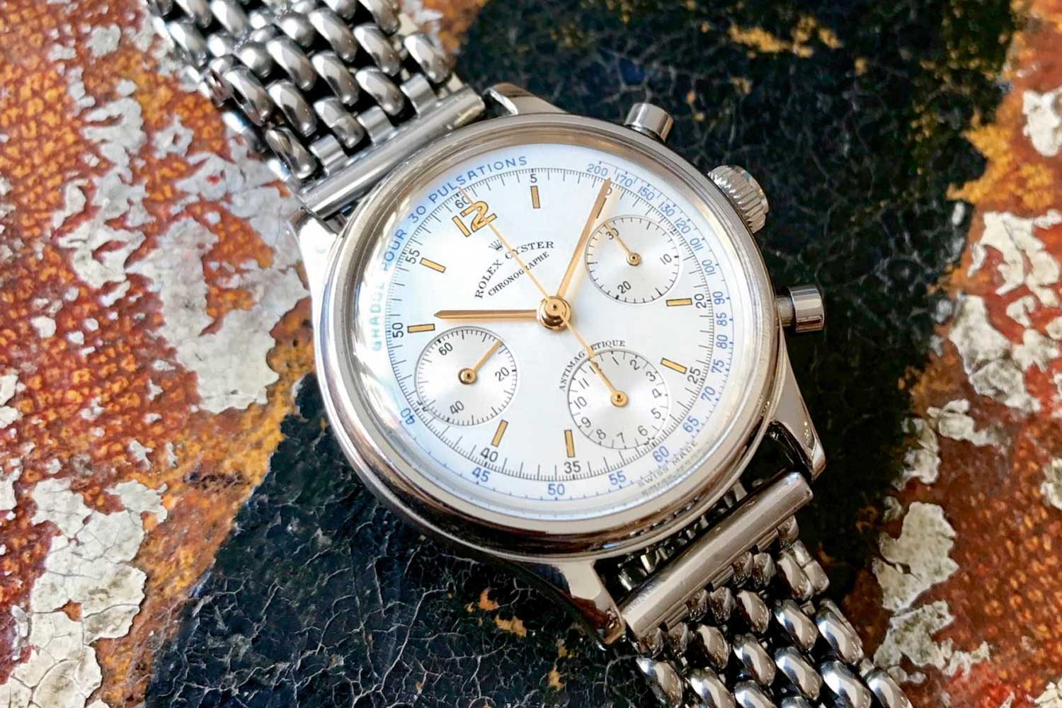
A three-register Oyster Chronograph ref. 4080 (Image:C Matarelli)
The first actual sports chronograph came in 1963 in the guise of the reference 6239. Having been through a couple of decades of pre-Daytonas, it was in 1963 that the star was born. The 6239 was seen as an actual sports watch due to its 36mm steel case and bezel ring in the form of a tachymeter. The watches, however, still featured pump pushers and so were not blessed with the word “Oyster” on the dial; this also applied to the 6241 with black plastic tachymeter as well as references 6262 and 6264.
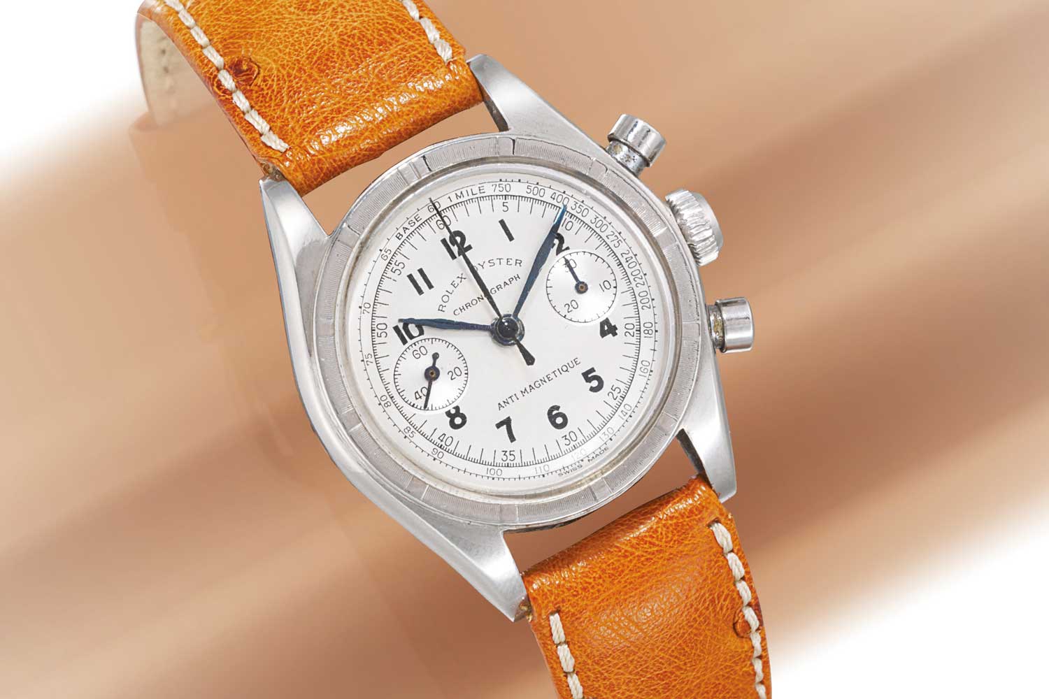
A small 29mm ref. 3481 (Image: Christies.com)
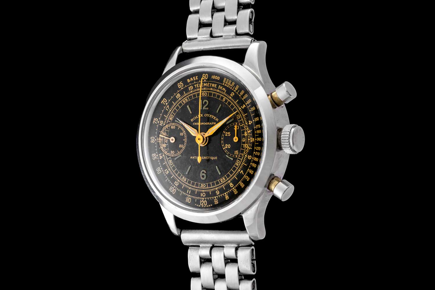
A monoblocco ref. 3525 (Image: L Garbati)
Testing, One, Two, Three
The 1960s and ’70s were the era of cool racing chronos in eye-catching hues and interesting dial designs. Arguably, now, the most iconic and colourful dials were the exotic dials used in the Daytonas — what we now know as “Paul Newman” dials. The 1960s was long before Rolex’s current vertical integration and, as such, the brand relied on different companies to manufacture the various components of its watches. The dials were largely made by Singer and, as part of this working relationship, Singer would periodically offer new design concepts to its clients. We now have a pretty clear idea of how this process worked as, a number of years ago, a collection of Singer dial books was discovered that included design proposals for a number of brands, the most interesting of which were dial suggestions for Rolex and Tudor.
During the 1950s and ’60s, Tudor had grown in popularity and reputation as a high quality watch commensurate with Hans Wilsdorf’s vision for it to have all the quality hallmarks of a Rolex at a more accessible price point. And, by and large, it had toed the party line and behaved itself, with a respectful line of superb Submariners and classic Oyster watches with some very interesting yet classic dials. In 1970, though, the brand truly showed its colours with the launch of the chronograph. And it was the robust, of-the-time-looking, waterproof chronograph that the Daytona simply wasn’t. A strong 40mm Oyster case, with square crown guards and screw-down pushers made it a true sports watch that was both cool and current in equal measure. This was also down to the dial and hands design that was striking in its use of vivid orange against a canvas of fresh-looking grey with black accents. This use of colour had always been part of the plan as the dial studies found in the Singer folders demonstrate.
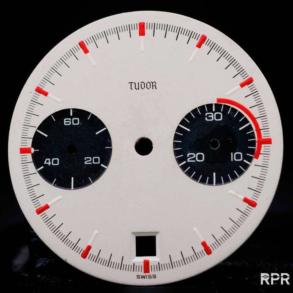
A Singer chronograph dial proposal from the late 1960s in white
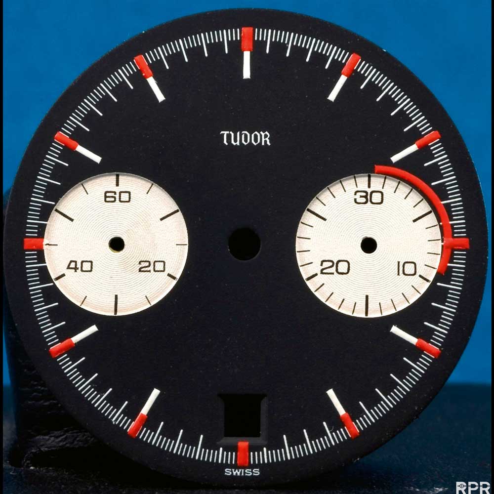
A black version of the proposed dial design (Images: RolexPassionReport.com)
These dials have red accents on the outer markers and a (roughly) 10-minute section on the minutes counter. These Singer test dials were often quite crude in execution, as we can see on other examples such as the Yacht-Master mono-counter dial that exists. I believe they were to give an idea of colour palettes and general ideas, almost like quick sketches. Interestingly, the black dial shown here was sold by Phillips in 2017 together with a reference 7032, for CHF 93,750. That’s a serious premium!
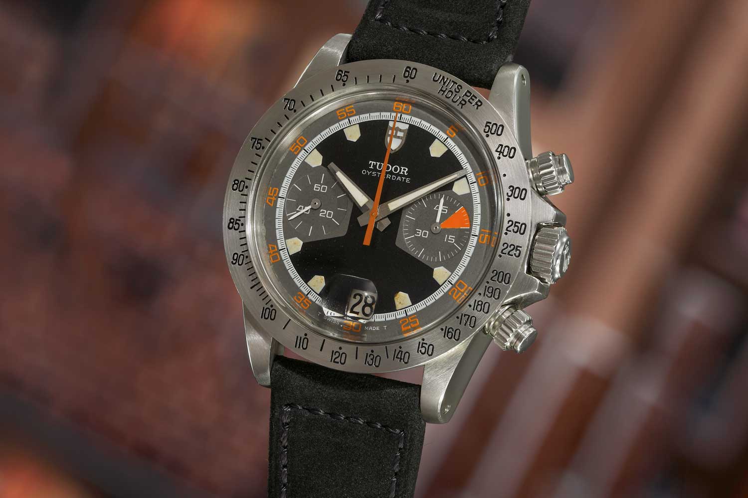
Tudor unveiled the 7000-series watch with the references 7031 and 7032 in 1970. Seen here is the ref. 7032 with black dial (Image: Phillips.com)
The ‘Homeplate’
The actual watch that Tudor launched was vastly different to the rejected test dials, and it has become one of the most instantly recognisable vintage chronographs in existence. Tudor unveiled the 7000-series watch with the references 7031 and 7032 in 1970, and it was a striking watch indeed. As I alluded to earlier, the case was and is important. Tudor offered the watch in a 40mm case, which was more akin to watches such as the Submariner and Sea-Dweller, and not chronographs. The crown guards were square, like the ones seen on very early 7928 Submariners from the late 1950s, and the watches were fitted with large 7mm Twinlock winding crowns. Unlike the Daytona, the watches also had a date feature, the aperture of which sat beneath a horizontally placed cyclops on the crystal at six o’clock. References 7031 and 7032 were essentially identical with the only difference being the bezel. The 7031 featured a black plastic tachymeter bezel much like the bezel on the 6263 Daytona. The 7032 featured an all-stainless-steel tachymeter. This system was to be used for the next 30 years to differentiate Tudor chronograph models.
The most striking aspect of these first-series chronos were the dials. Tudor opted for a design that was both bright and unusual in its use of detail. The most notable feature of the 7000-series watch was the shape of the hour markers, which were like the home plate on a baseball field. This led to collectors giving the watch its well-known nickname the “Homeplate”. The main colour for the dial was grey, with a black outer track that had five-second numerals in bright orange. The running seconds counter and 45-minute counter were black, with the latter having a bright orange triangle in the five to 10-minute portion. The stopwatch centre seconds hand was also bright orange.
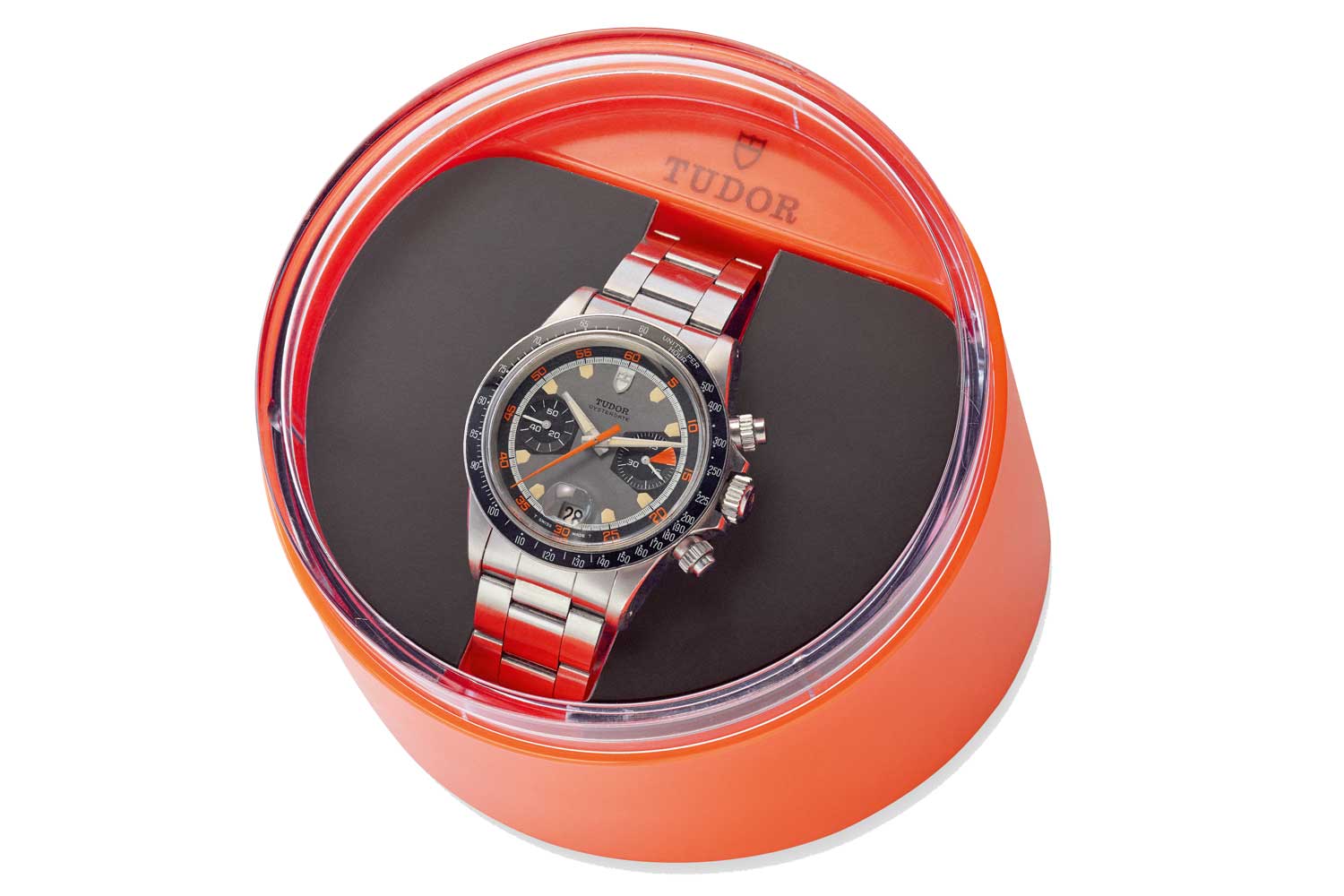
The “Homeplate” era — a ref. 7031 in its original box. The most notable feature of the 7000-series watch was the shape of the hour markers, which were like the home plate on a baseball field.

Home base on a baseball field
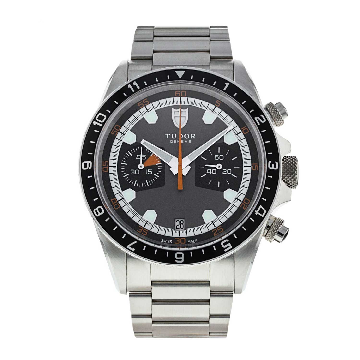
This Heritage Chronograph takes the orange accents and unique 'homeplate' hour markers from the original watch but the modern interpretation has a sapphire glass and automatic movement.
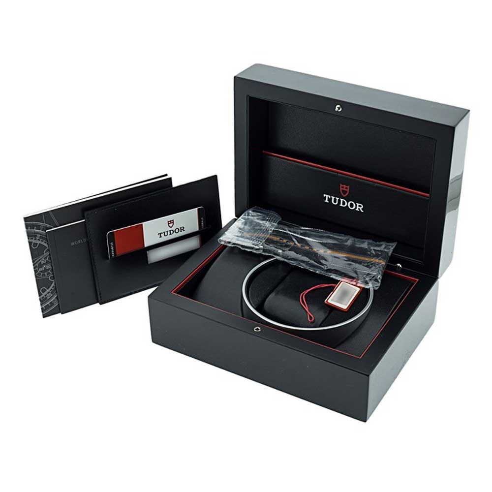
The watch comes with the original set of box and papers.
The ‘Monte Carlo’
Following hot on the heels of the first-series Homeplate chronographs of 1970, in 1971 Tudor launched the second series of chronographs. The flamboyant use of colour that marked out the Homeplates was continued with vivid tones of orange and blue-dialled watches now complementing the grey and orange colour scheme that was first seen on the Homeplates. Compared to other watches in the Tudor and Rolex lineups, these watches were both big at 40mm and eye-catching in their execution.
In the second series of chronographs, the homeplate markers were replaced with more conventional rectangle-shaped lume plots. The use of bright orange remained with eye-catching elements both on the chronograph registers and on the outer seconds markers. The watches became known by collectors as “Monte Carlos”, as the dials resembled the roulette tables of the famous casinos of Monaco’s famous district.
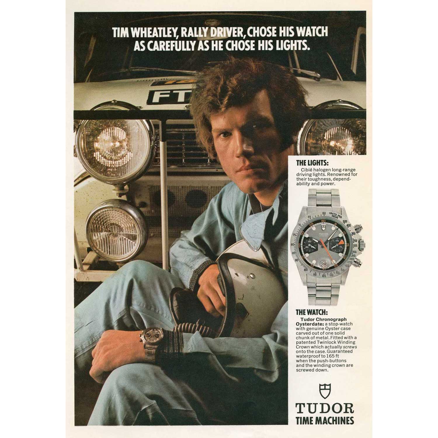
An old Tudor advertisement
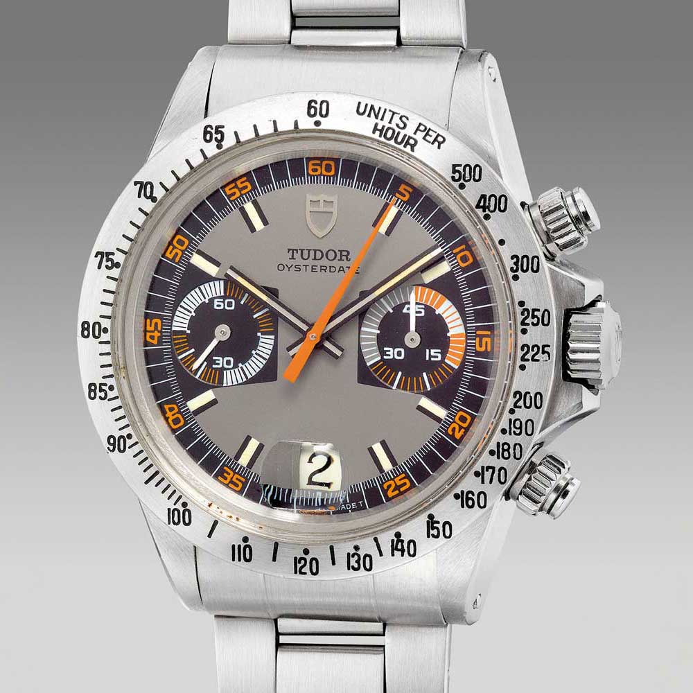
A second series “Monte Carlo” chronograph ref. 7159 with steel bezel (Image: Phillips.com)
The elongated triangular orange stopwatch seconds hand was carried over from the Homeplate as well as the presence of two subdials and date aperture at six o’clock. The introduction of the blue element on some watches necessitated a blue acrylic tachymeter bezel instead of black on the 7149s and a blue 12-hour bezel insert on the 7169.
The cases of both the first- and second-series chronographs remained largely unchanged, with the cool square-shaped crown guards and large-size 40mm diameter. The Monte Carlos remained in the Tudor catalogue until approximately 1977. The biggest non-visual change was, however, the improved movement. The Homeplates were equipped with the Valjoux calibre 7734 which had been a good workhorse for the watches. The second-series chronos housed the Valjoux calibre 234. This was a high-frequency movement with improved accuracy that also had upgrades to the column wheel and clutch.
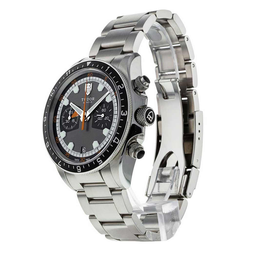
The present example is a grey dialed version of the watch that features styling cues from Tudor’s very first chronos from 1970.
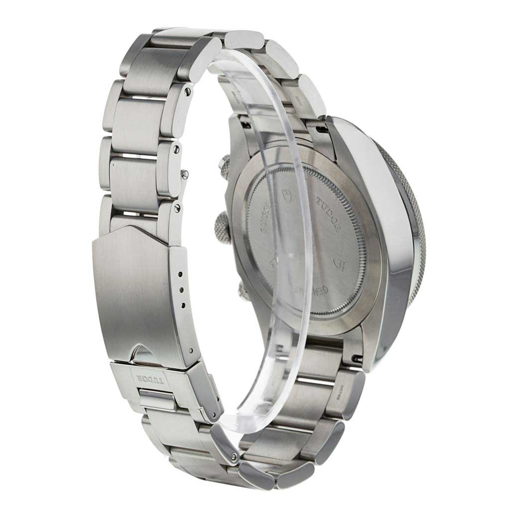
The present example is a grey dialed version of the watch that features styling cues from Tudor’s very first chronos from 1970.
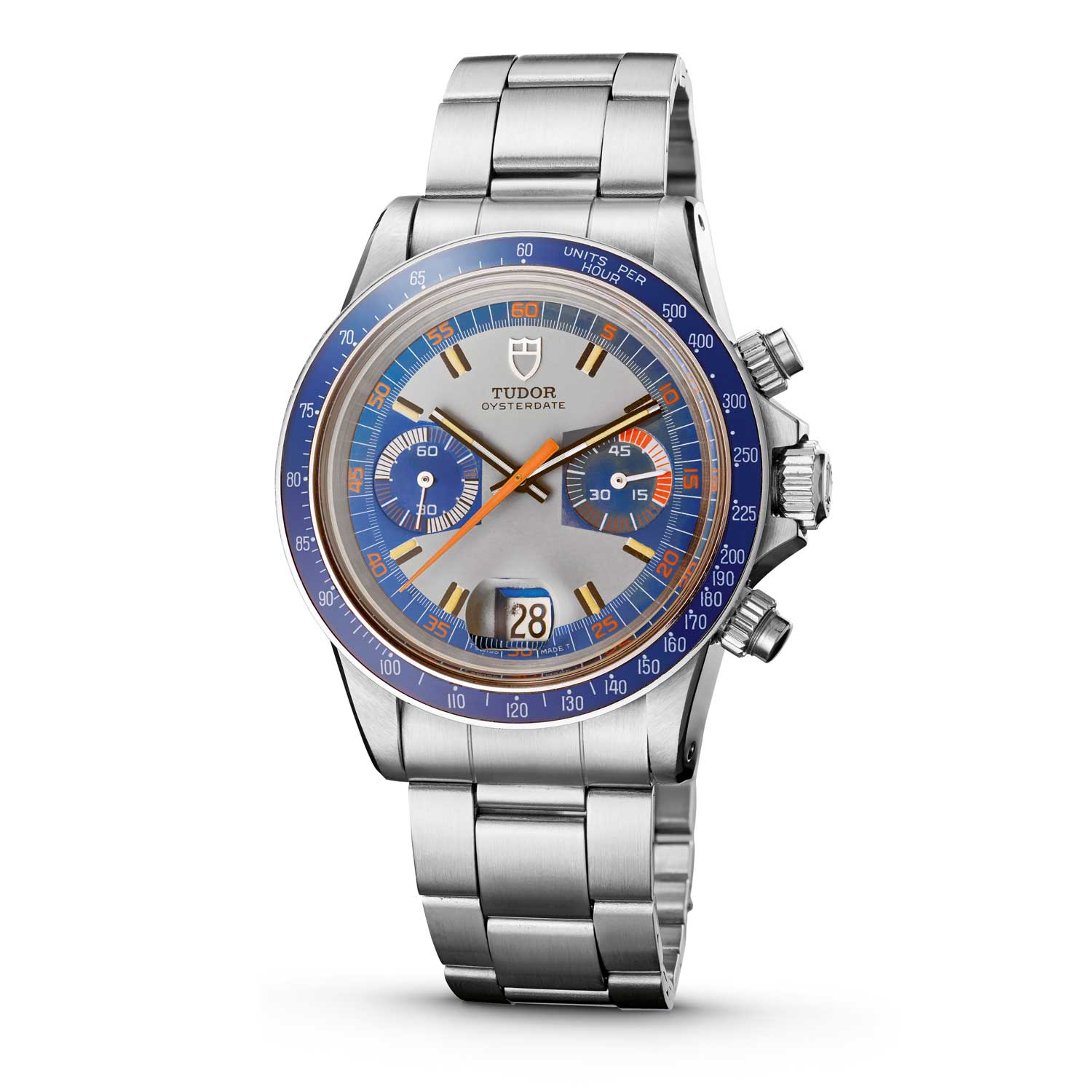
A family resemblance—an original Tudor Monte Carlo (left) next to the Heritage Chrono Blue
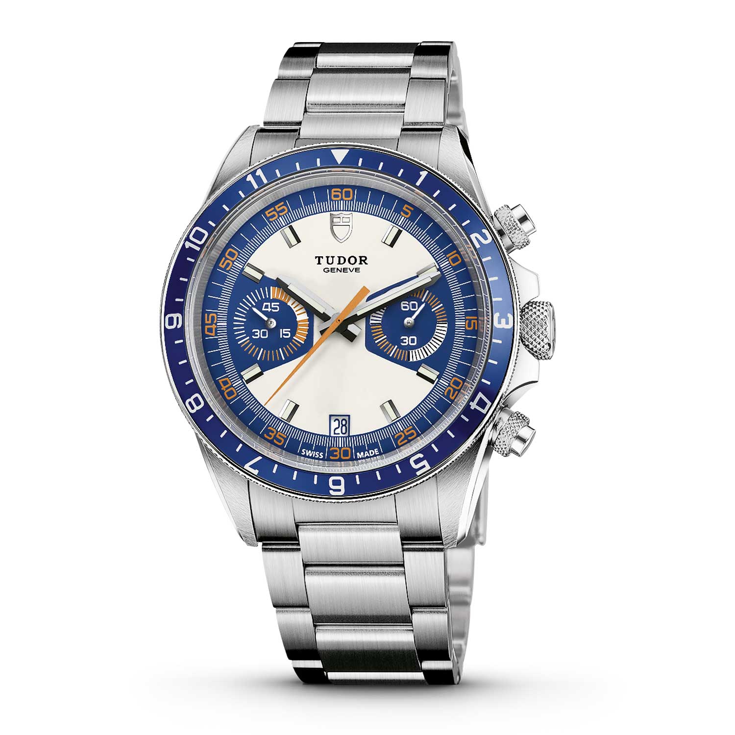
A family resemblance—an original Tudor Monte Carlo (left) next to the Heritage Chrono Blue
The ‘Big Block’
In 1976, the house of Wilsdorf launched its first automatic chronograph. And it wasn’t a Rolex, it was a Tudor self-winding chronograph, a full 12 years before Rolex introduced their first automatic Daytona, the Zenith-powered 16500 series, in 1988. This was a real coup for Tudor and put them ahead of other chronograph manufacturers of the 1970s. In fact, it was this automatic movement that led to the watch’s nickname. The rotor and auto-wind mechanism of the movement meant that Tudor needed to design a new watch case that was deeper, hence the collector term “Big Block”. A second aesthetic change that occurred with the Big Block was the introduction of a third chronograph register on the dial — an hour indicator. The previous two series, the Homeplates and Monte Carlos, were effectively 45-minute stopwatches, but the new watches could measure much longer periods of time.
The first Big Block watches were the 9000 series with their references differentiated by the bezel type. The 9000-series watches were: the references 9420 with plastic tachymeter bezel; the 9421 with 12-hour calibrated bi-directional bezel and the 9430 with steel tachymeter bezel.
All vintage Tudor chronographs featured a date and Oysterdate appeared on all the dials going back to the Homeplate watches in 1970. The third-series chronos were also Oysterdates, but very early dials had the words “Chrono Time” or “Automatic — Chrono Time” in an arc over the bottom chrono register.
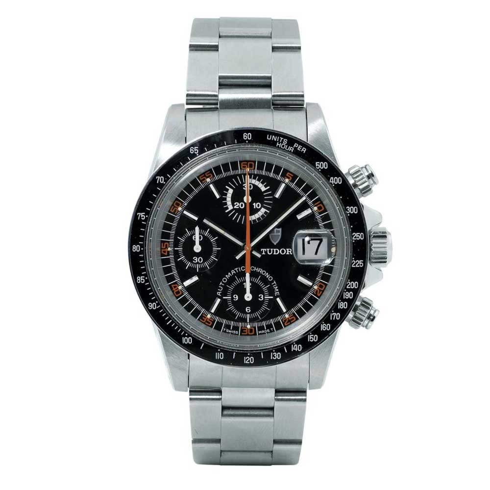
Big Block ref. 9420 with Bakelite tachymeter bezel
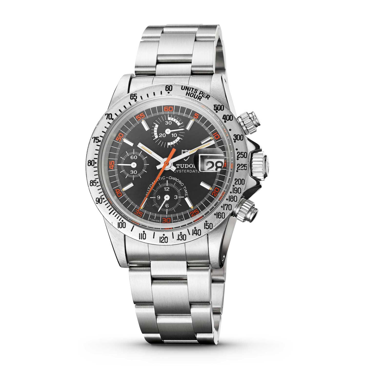
The original “Big Block Exotic Dial” ref. 9430
The ‘Exotic Dial’
Anybody with even a passing interest in vintage Rolex and Tudor watches will be aware of the importance of the “Exotic Dial” chronographs. In Rolex terms, it is the Paul Newman and with Tudor, the Homeplates and Monte Carlos. Tudor continued to produce exotic dials that picked up where the Monte Carlos had left off. Collectors also refer to these dials as “Big Block Monte Carlos” or “Exotic Big Blocks”. There were two variations of Big Block Monte Carlo dials — a version with painted hour markers that were very reminiscent of the 7100-series watches, and a version with applied metal hour markers. The dials with painted hour markers were available in two colourways — grey/black/orange and grey/blue/orange.
Both dial colours were available in all three references. The black version was always teamed with a black tachymeter or 12-hour bezel, and the blue dials with blue tachymeter bezels. These watches are now very rare and are sought after by collectors, especially the blue 9420. The dials with applied metal hour markers were only produced in black, which featured white subdials and orange numbers on the outer minute track. This dial was only featured in two references — the 9420 watch (with a black plastic tachymeter bezel) and the 9430 (with stainless-steel tachymeter bezel).
In the late 1980s, Tudor replaced the 94300-series watches with the 79100 series. These watches retained the successful Big Block case; however, these watches were only available with the two-colour, non-exotic-dial configuration. As with the 9400 series, there were three references which were all differentiated by their bezel type:79160,with a black plastic tachymeter bezel; 79170 with a black graduated 12 hour bi-directional bezel; and 79180 with a steel tachymeter bezel.

Big Block ref. 79170
The Prince Chrono
In 1995 Tudor launched the new Prince chronograph. Up until this point the cases of the Tudor chronos had been quite deep and flat sided — a true “presence” on the wrist. The fourth series witnessed a complete redesign of the case. Gone were the flat sides and sharp edges, and instead a softer case was utilised that was very similar to its stable mate the Rolex Daytona. This new sleek aesthetic was further enhanced by the introduction of a sapphire crystal, which accentuated the lower profile of the watch on the wrist. The previous plastic bezels were problematic in that they were delicate and could crack quite easily. In the new series of watches the 79260 had an aluminium tachymeter insert in the bezel. There were three watches available, the reference number referring to the bezel type. They were 79260 with black aluminium fixed tachymeter bezel;79270 with black aluminium rotating 12-hour bezel;79280 with polished steel fixed tachymeter bezel.
As per their predecessors, the Big Blocks, the new 79200 series watches were initially available on steel Oyster bracelets, but Tudor’s interpretation of the Jubilee bracelet eventually became the default bracelet as the Oyster faded out. It wasn’t just the Oyster bracelet that was phased out – the word Oyster disappeared from the dial and was replaced with “PRINCE”. During the first couple of transitional years, the use of Rolex branded winding crowns and casebacks were also phased out in favour of Tudor versions. The Prince Dates were available with dials in a kaleidoscope of colours, many of which came with matching leather straps – I think of them as Tudor Beaches, much like the limited Rolex Daytona beach edition from 2000! The dial options were supplemented with versions that had painted Arabic hour markers instead of the applied baton markers. Tudor’s tie-in with brand ambassador Tiger Woods led to the golfer’s name being used on some dials, which are known by collectors as Tudor Tigers.
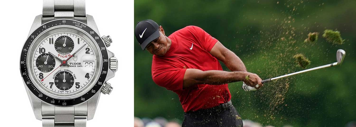
Tudor’s tie-in with brand ambassador Tiger Woods led to the golfer’s name being used on some dials, which are known by collectors as Tudor Tigers.
Something of a ‘sleeping giant’, these fourth series chronos are picking up as collectors are beginning to appreciate them for their modern aesthetic and super high build quality. They are also beginning to appear in the major auctions, so I would head over to our online store right now, to grab one whilst you still can!


