
The Fonts of Time
A watch font that is immediately noticeable can often cause a distraction from the overall design of a dial and spoil the harmony of the watch altogether. It is a little like the music in films which is supposed to set the scene – not have you reaching for your phone to Shazam a tune.
Having said that, paying attention to the details is all part of the appreciation of a fine timepiece, and looking into the world of horological fonts reveals a rich history that spans the fields of archaeology, printing, IT, psychology, art, design and much more.
A brief history of numbers
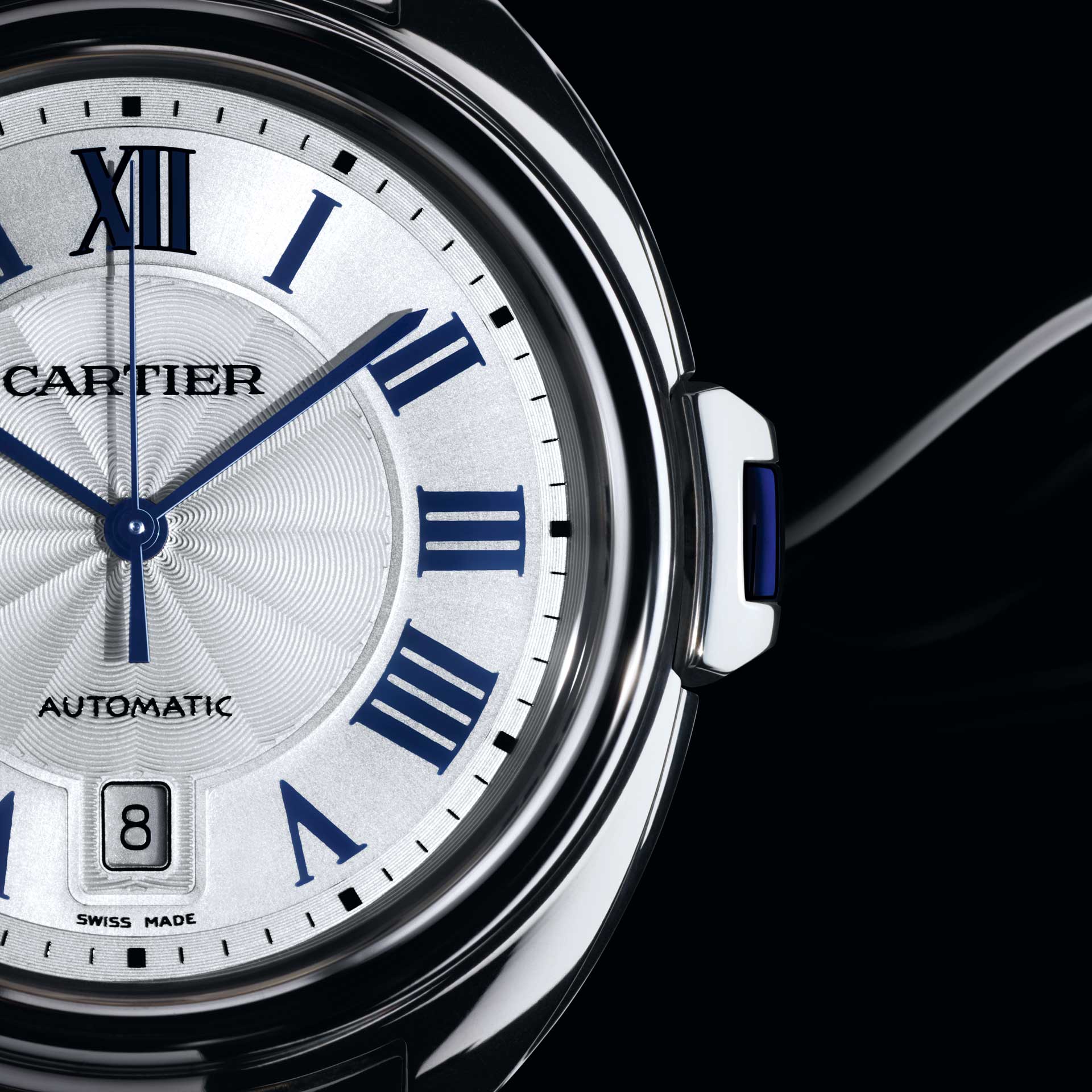
The story of where written numbers come from is intimately linked to timekeeping. Early civilisations needed to keep track of the days, the phases of the moon and the cycles of the seasons for their own survival. The first written numbers were recorded using a tally system, where lines would be carved into a stick or bone. Almost all number systems started in this way and most number ones still use a single line to mark its distinction. As time evolved, and the need to record greater quantities arose, the numbers evolved with it to include a bar across four lines to mark five and a cross to mark ten. This system was the precursor of the Roman numeral system that is used by almost all watchmakers today in at least one of their collections.
The origin of fonts
The beginning of the history of fonts, however, didn’t occur until some 700 years later. It all started in Germany in the 1440s with Johannes Gutenberg and the very first mass-production printing machine. Gutenberg’s invention used individual metal letters that could be reused and reconfigured as many times as needed. These first letters and numbers were made to look like the elaborate handwriting of the scribes, mainly because that is what people were used to reading.
Over the following decades, printing presses were set up across Europe, each with their own unique font. Little by little the style of the fonts moved away from the ornate gothic fonts of old, in favour of less elaborate letter-forms. By the 16th century, fonts had evolved into the Roman type, mainly thanks to the work of Frenchman Claude Garamond whose type was the most popular in Europe for the better part of 200 years. The Garamond font is still used in some children’s books today, including Dr. Seuss and the American editions of the Harry Potter series.
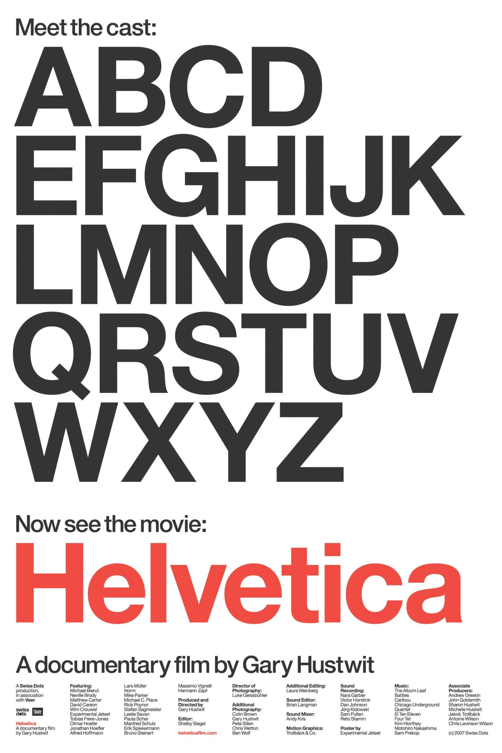
The history of fonts is such a large subject to cover in a few lines, but we cannot skim over it without mentioning the Swiss. Not only renowned for their watchmaking talents, the Swiss are also recognised for their input into the history of fonts. After the Second World War, modernism swept across Europe and no area of design was left untouched, including the field of font design. In 1957, two new fonts emerged, Univers by Adrian Frutiger, and Helvetica by Eduard Hoffmann and Max Miedinger. Both had a huge influence on the modern world as we know it.
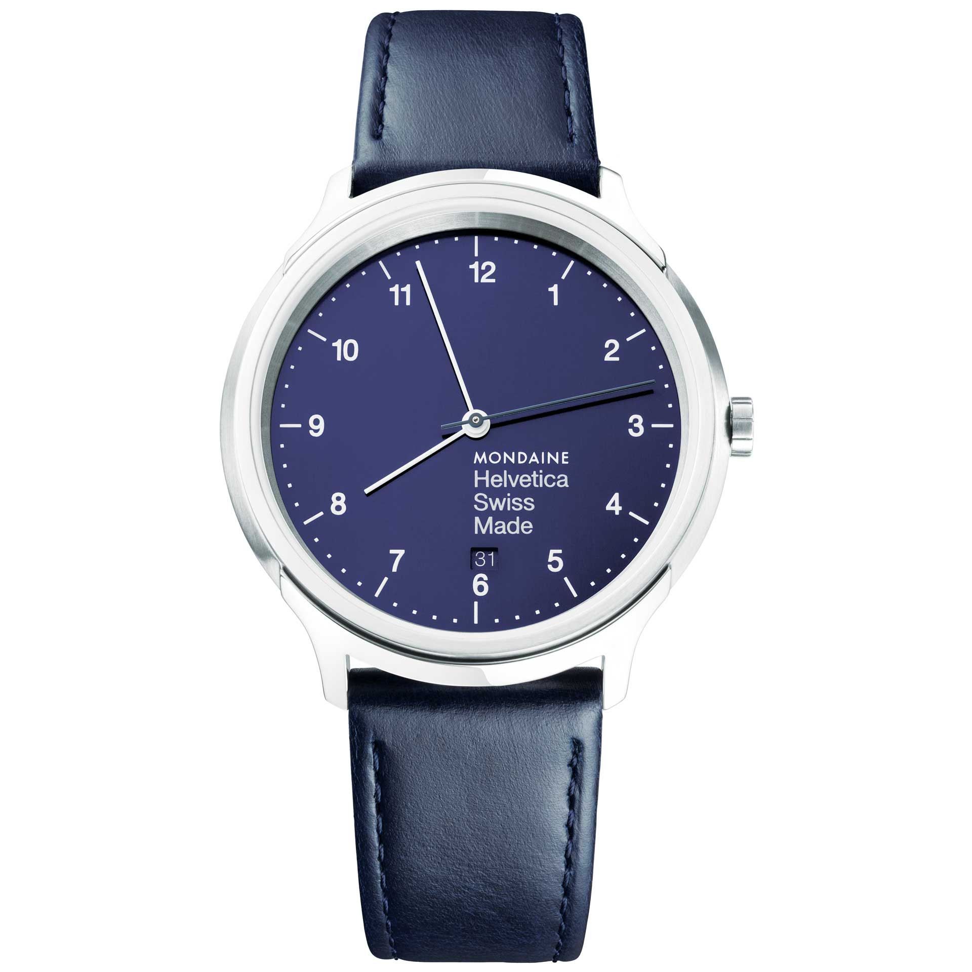
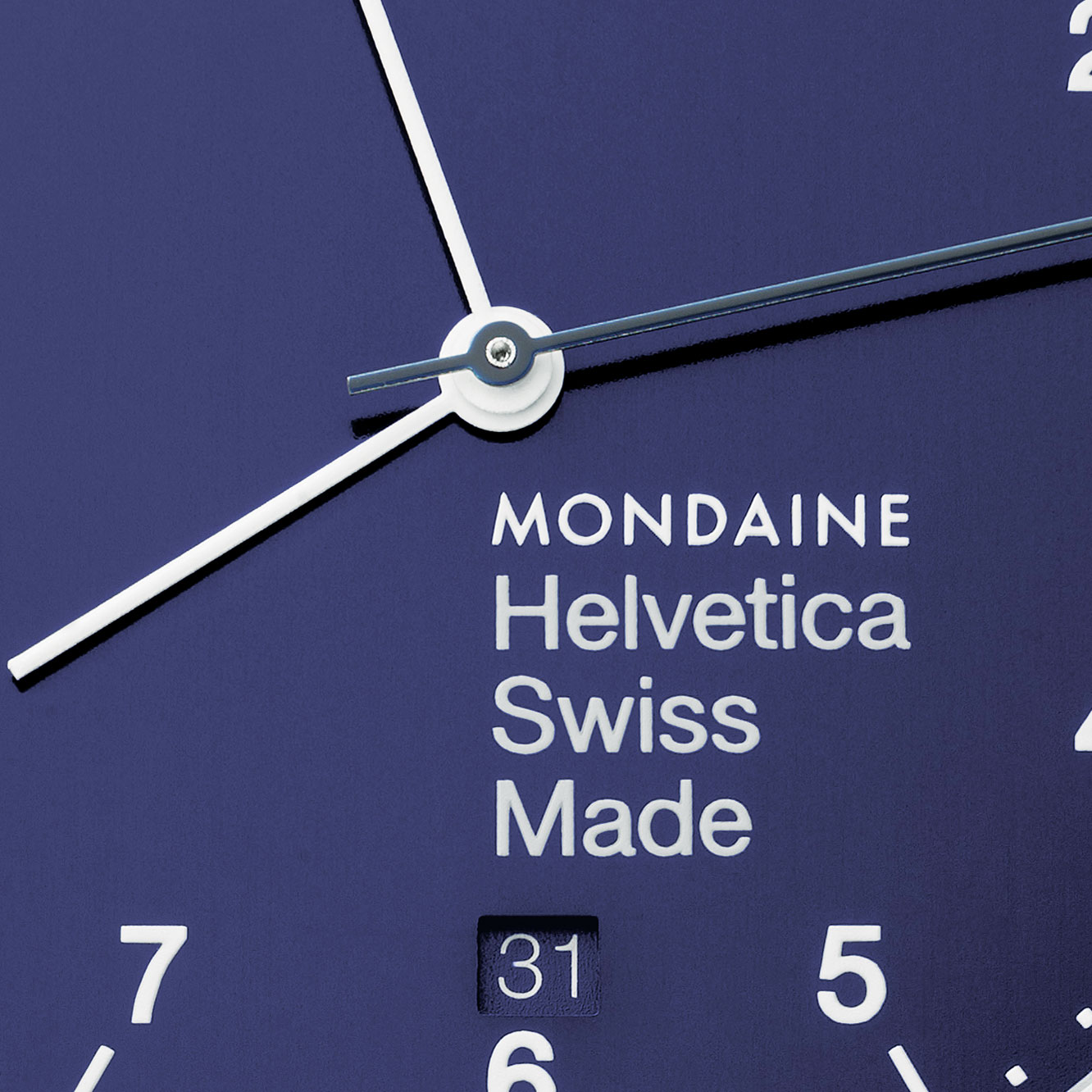
Helvetica has since become a cult typeface and the font of choice for a number of watch companies, including Mondaine, which even has a collection dedicated to it. Helvetica is a favourite of some of the world’s leading brands, such as Nestlé, BMW, Jeep, North Face and Oral B, to name a few, and the little characters even inspired filmmaker Gary Hustwit to make a movie about it called, quite simply, Helvetica. In 2010, New York type designer Cyrus Highsmith set himself the challenge of getting through a day without Helvetica and it was an impossible challenge. He had to search long and hard for clothing without Helvetica washing instructions on the labels, he couldn’t take the subway, he couldn’t read The New York Times, and he ended up closing his eyes for a good part of the day, drinking Japanese tea.
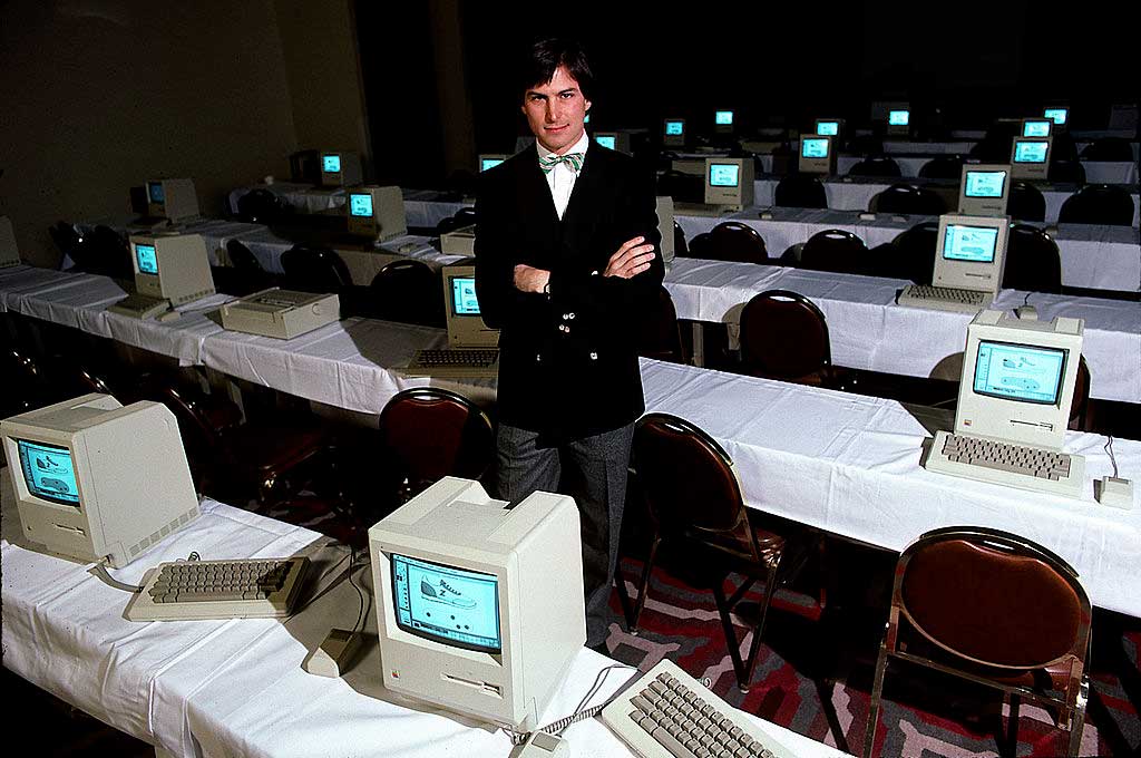
The next font revolution is credited to none other than Steve Jobs, who, after dropping out of Reed College in Portland, Oregon, decided to stay on to take a calligraphy class. In an address to students at Stanford University in 2005, he explained the impact it had on him: “I learned about serif and sans serif typefaces, about varying the amount of space between different letter combinations, about what makes great typography great. It was beautiful, historical, artistically subtle in a way that science can’t capture, and I found it fascinating.”
Jobs’ love for typeface led to a complete change in digital typography. Early computers only had one font, called Digi Grotesk (designed in 1968 by the German designer Rudolph Hell for cathode ray typesetting machines), but when Jobs designed the Macintosh computer in the 1980s, he decided to offer users a choice of fonts. This was the first time people were able to choose a font that they liked, and it allowed them to express themselves digitally.
Everywhere we look we see an array of different fonts. From the tube of toothpaste we grab in the morning, to the letters on our coffee machine, to the road signs on the way to work, the newspapers we read and the time on our watches (more of this soon, I promise). Fonts are everywhere, and they have been everywhere since we were small children able to recognise the packaging of our favourite sweets or the letters on our toys. We have been learning about the secret meanings of fonts our whole lives, without even realising it.
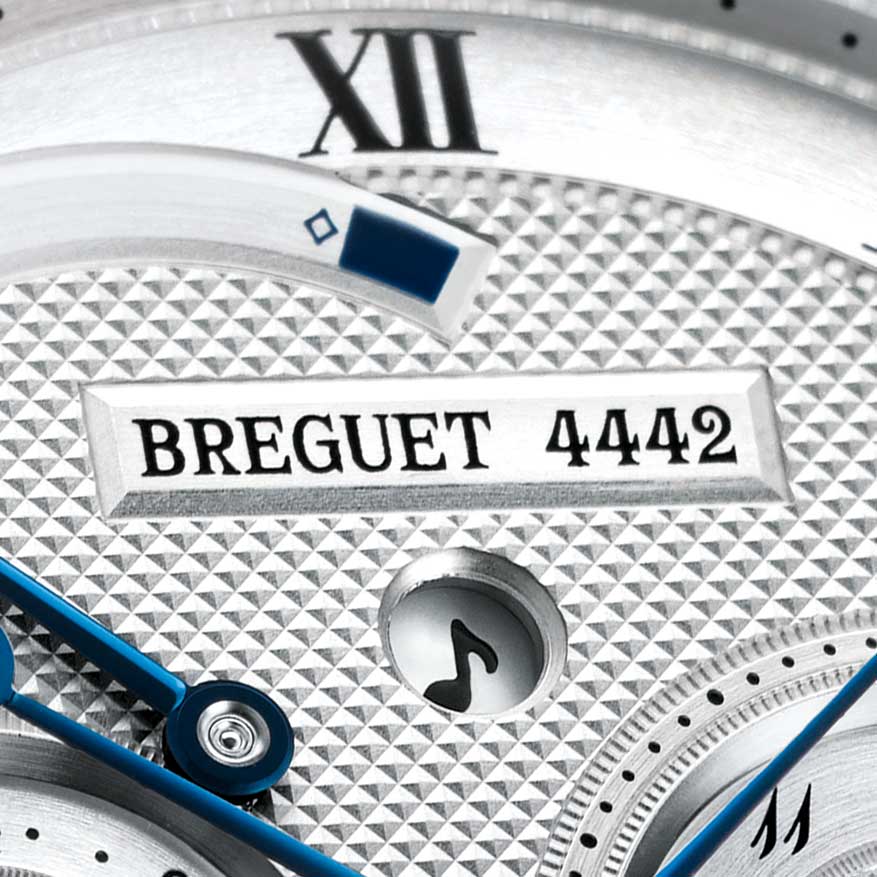
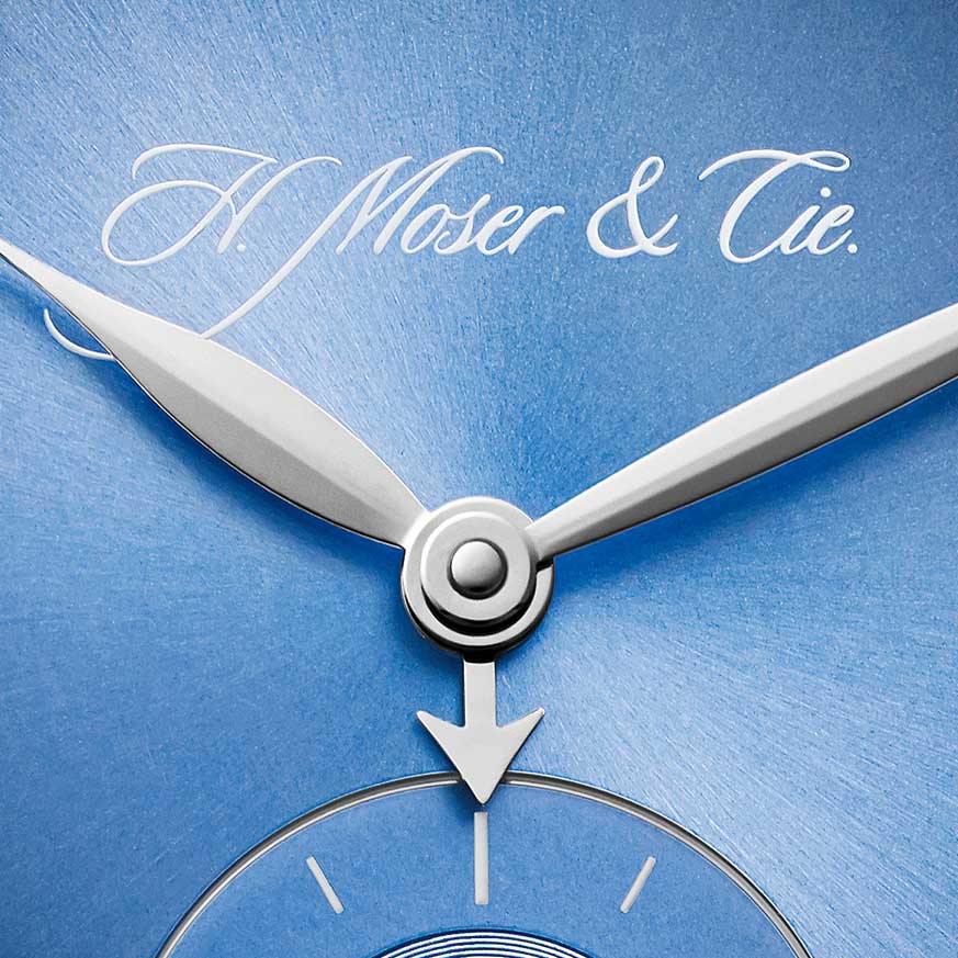
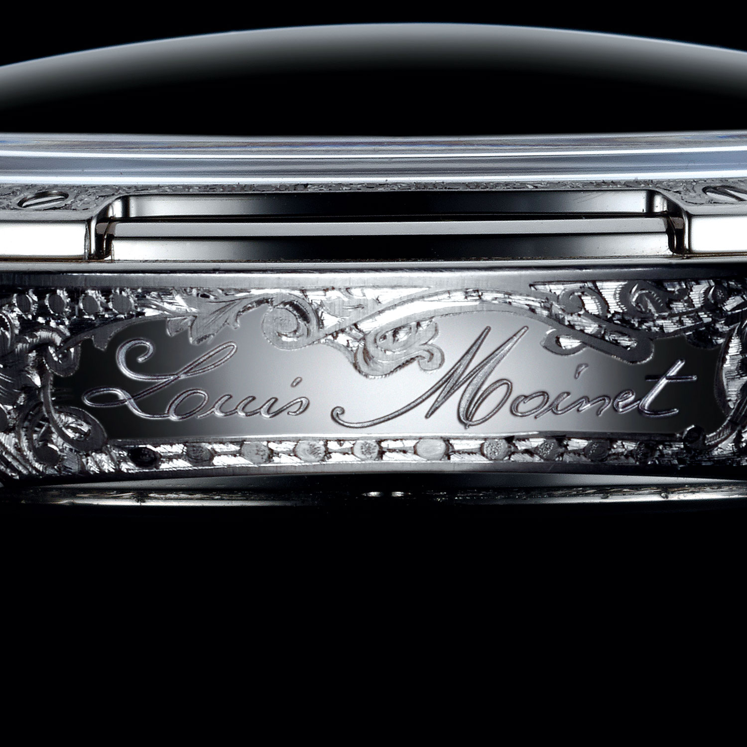
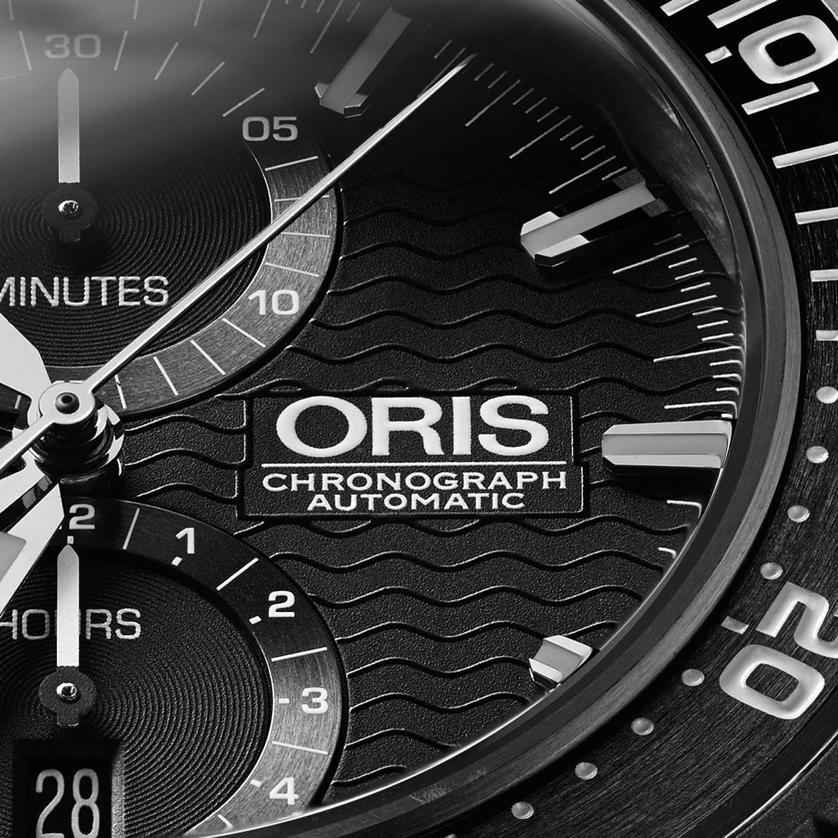
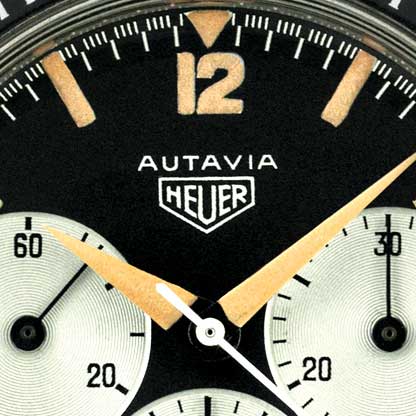
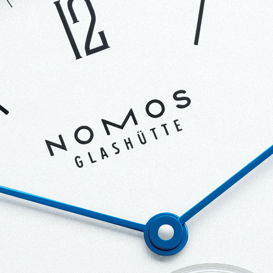
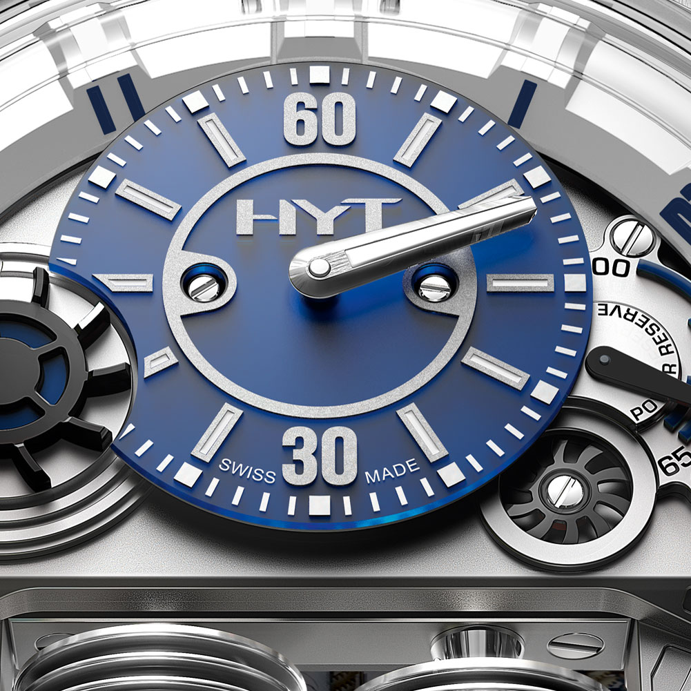
Our brains are very clever pattern-matching machines. Every font we have ever seen gets processed and catalogued so that when we see a fancy script font, for example, we immediately associate it with something handcrafted, luxurious and expensive (think Breguet, H. Moser & Cie or Louis Moinet). When we see a simple sans serif font, we often make the connection to a product that has a cool design, is trustworthy, reliable and precise, (like Tudor, Nomos or IWC). Sporty fonts taken from the automobile or aeronautic industries communicate adventure, speed and endurance (as in Zenith, Blancpain and Chopard, among others). There are even feminine and masculine fonts with the female versions often preferring curvy lettering and the male versions striking a pose in thick bold typefaces.
Fonts help us choose what we like. If you picked up a copy of Revolution and all the watches featured the font Times New Roman, for every brand name logo and numeral, it would take you much longer to decide which timepiece you liked best. You would have to do far more reading and research to figure out which watch suited you the most. So our brains file all these design codes away to help us make informed decisions when needed.
Fonts turn words and numbers into personalities that influence our interpretation of the products they adorn. Take our quiz here to see which watch appeals to you the most by first choosing the type of font that you like best. Then click through on your favourite font type to find out which watch brand the font is from. (The quiz is based on a similar survey by Sarah Hyndman in her book, Why Fonts Matter. She asks people which font they would date, and the results are uncanny.)


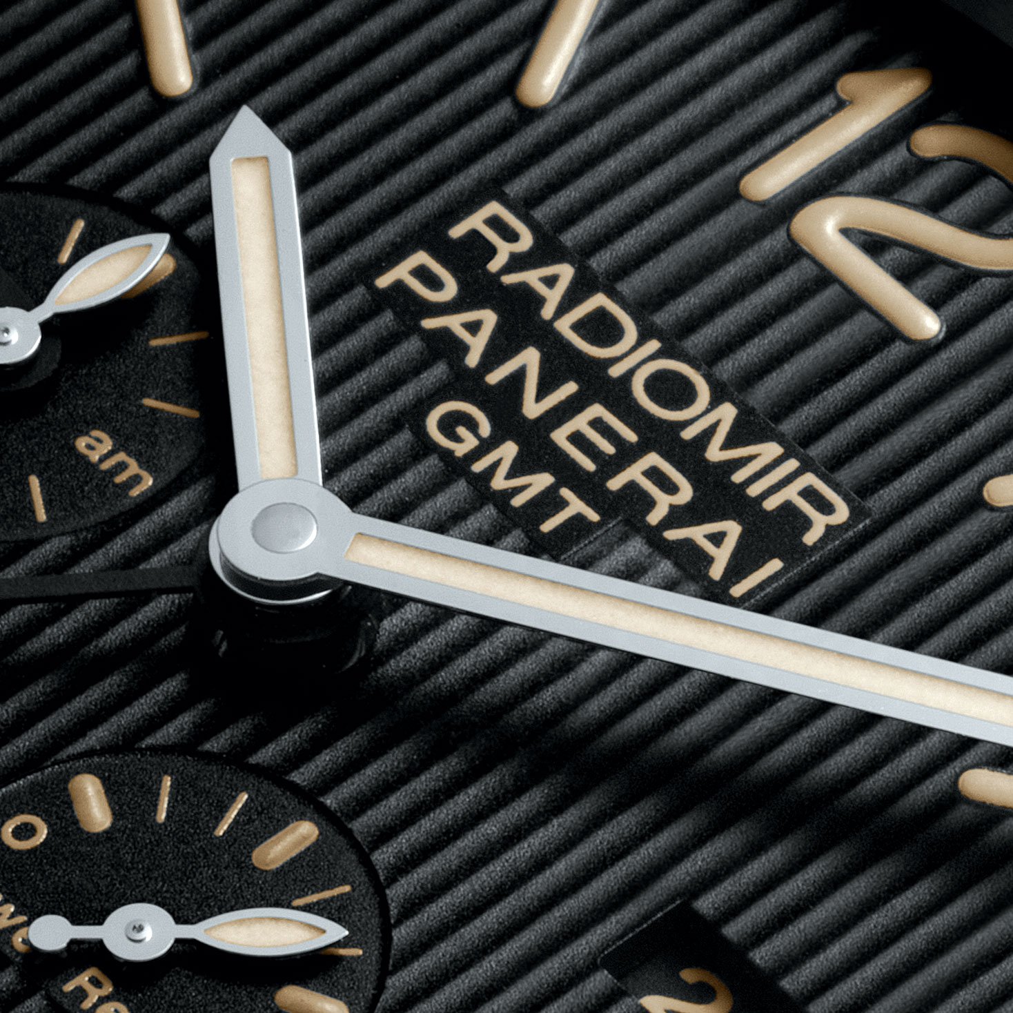
You may find that you are drawn to space-age fonts like the Star Wars typeface used by MB&F, or the elegant swirls of the Breguet font may be more your thing (Breguet didn’t just invent the tourbillon, but one of watchmaking’s most famous fonts, too). Or perhaps you are more attracted to German precision and engineering with the simple, no fuss industrial fonts that almost tick-tock all on their own.


Fonts don’t act on our subconscious mind; they send supraliminal messages to the brain. We are aware of supraliminal messages as they are above the threshold of consciousness, but we often don’t pay attention to them. It is a little like the example of music in a film mentioned earlier: we hear it but don’t really notice it. If someone points it out to us, however, we are perfectly able to focus on it. Fonts on a watch dial act in the same way. They send us information about a watch, about its style, the type of people who may wear it, the kind of movement inside, and even give us an indication of the price, without us really being aware of these messages.
For the watch designer, choosing the watch font is extremely important. Get it wrong and it is like watching a film where the main character has been wrongly cast. We understand the story – like we can read the time – but it causes a distraction and ruins the overall result.
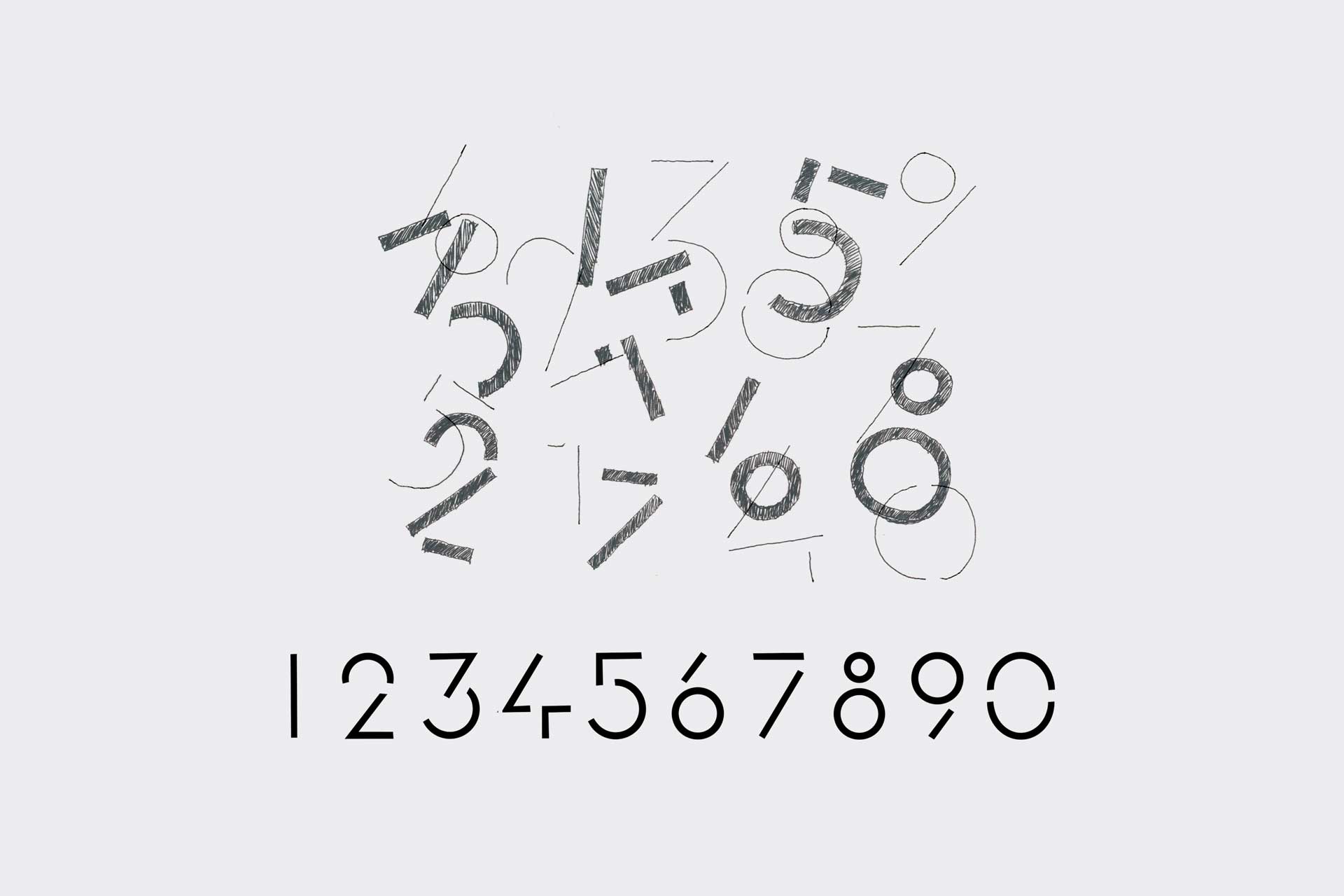
In the past, numerals were hand-painted onto the dial, or handcrafted in gold and then applied, making them an essential part of the creation of a dial. “Today, as everyone uses and abuses fonts, it has undervalued an art form that requires years of understanding and know-how,” explains Johann Terrettaz, independent graphic and typeface designer at Twice2. “In the case of watch design, the font should be an original design so that the watch has its own unique character; it shouldn’t feature a font that’s already on the market or one that is close to what the designer is looking for.”
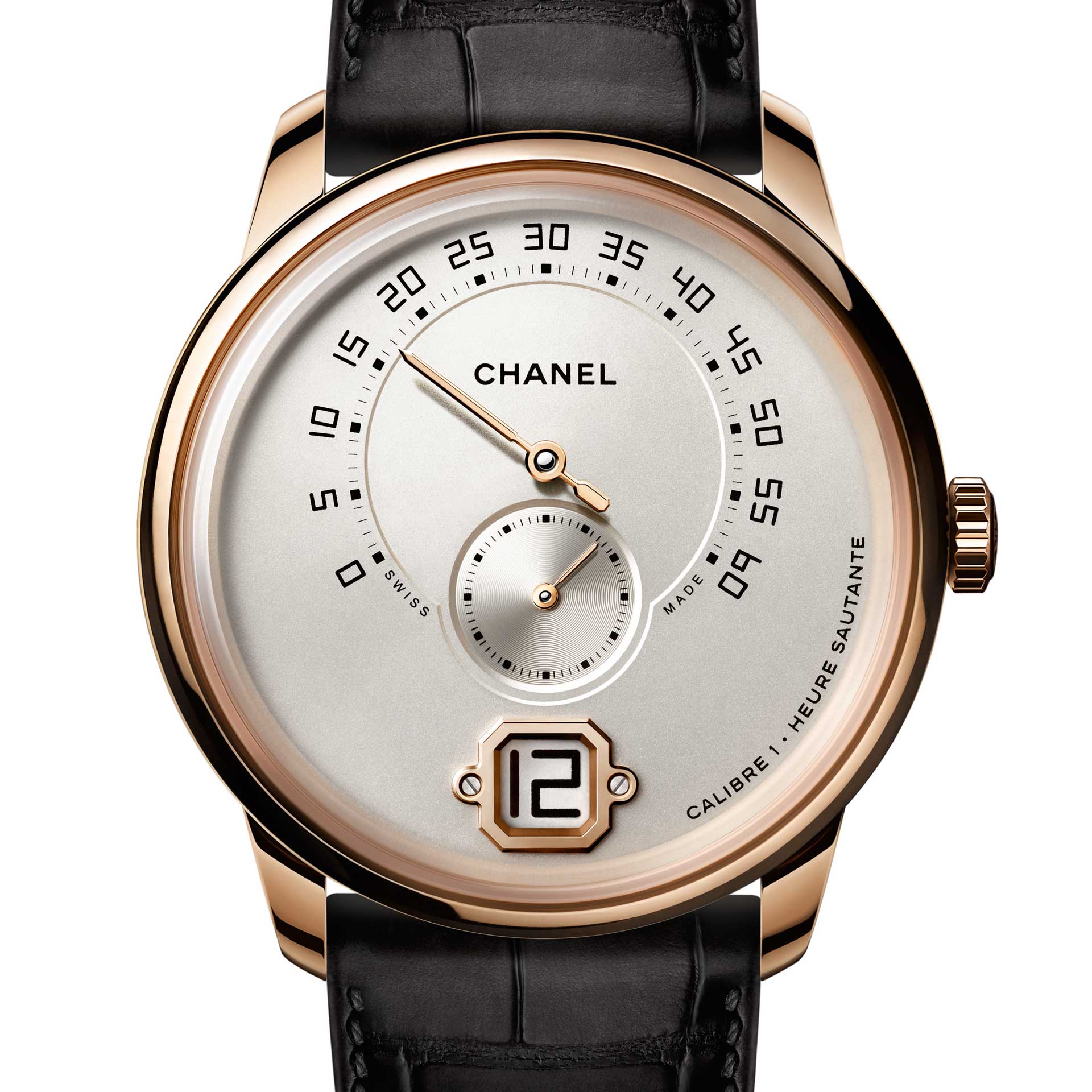
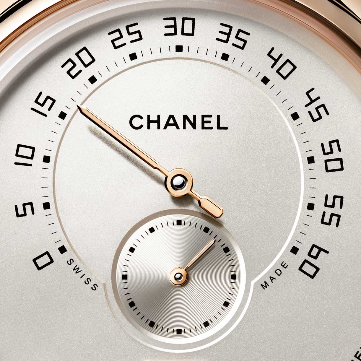
For Chanel’s Monsieur collection launched earlier this year, the French maison created a brand new font for the dial. “The biggest challenge when creating a completely new typeface is to make it unique,” explains Nicolas Beau, Director of Chanel’s International Watch Division. “We need to immediately understand where the watch comes from, what it expresses and what it evokes.”
“The typography must always be in harmony with the world in which the watch is intended to be positioned, where its own unique personality is different from others,” Terrettaz agrees. “The design of a watch and its typography are completely inseparable.”
Watch brand Mondaine found things quite challenging when it decided to incorporate the Helvetica font into a new collection. “Once we decided on Helvetica, it was a real challenge to develop it into a timepiece,” Mondaine’s CEO Ande Bernheim explains. “We use fonts but we don’t live fonts like typographers and font people. We had to really dig into typography, so we talked with a lot of people – professors, writers, typographers, designers – to see what the font really means, what it stands for.
“Then, we had to look for the right designer, someone who could translate the font into a watch, to get the spirit of a font which has been around for 57 years,” Bernheim continues. “The watch had to be modern, like the font still is today. Martin Drexel was the designer and he did a great job finding the right mix between a font and a watch.”
Dial design gets even more complex with the addition of complications where several different indications need to be included on the face of the watch. Designers will often mix numerals with indexes, or interchange Roman and Arabic numerals on the same dial to help legibility.
Under the loupe
Taking a moment to study a font opens up a whole new world of watch appreciation. It gives us an insight into the inner world of a brand and its values, as well as the challenges of watch design, and why we would choose one font over another. Our choice of watch has always spoken volumes about us – watches give off supraliminal messages all on their own – but a font can narrow things down even further. So next time you are winding your watch, take a look to see if you are more of the fancy French type or more of a retro-galactic warrior – your font could be saying more than you know.

You may also like
Reviews
Breguet Marks the 225th Anniversary of the Tourbillon with Four New Watches
Jun 26, 2026
Reviews
Breguet Marks the 225th Anniversary of the Tourbillon with Four New Watches
Jun 26, 2026
Reviews
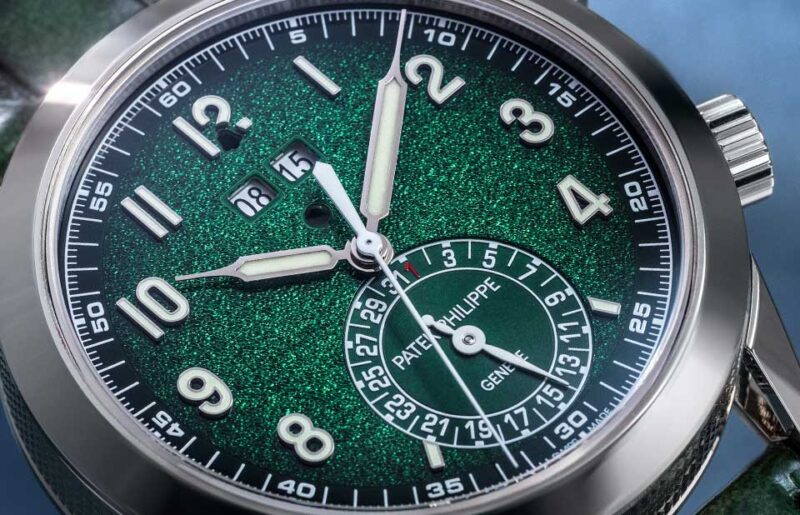
A Closer Look: Patek Philippe Calatrava Chiming Alarm 5322G
Jun 12, 2026
Reviews
A Closer Look: Patek Philippe Calatrava Chiming Alarm 5322G
Jun 12, 2026
Reviews
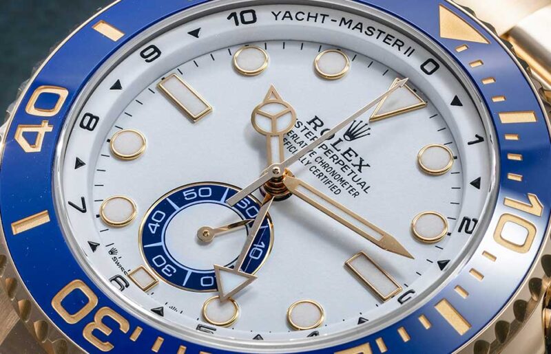
A Closer Look: Rolex Oyster Perpetual Yacht-Master II
Jun 2, 2026
Reviews
A Closer Look: Rolex Oyster Perpetual Yacht-Master II
Jun 2, 2026