

Color, Material & Finish: How the G-SHOCK Became a Cultural Icon
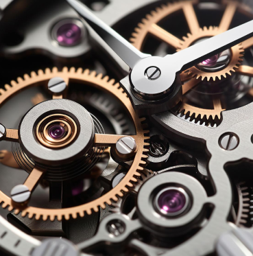
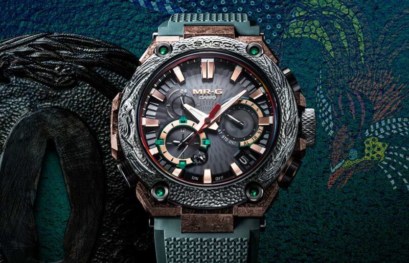
From the 1992 yellow DW5600 — the first G-SHOCK in color — to collaborations with the world’s most desirable street brands; to the use of metal in the hyper successful Aged-IP GMW-B5000V and the camouflage pattern GMW-B5000TCM-1DR, to the most recently launched MR-G HANA-BASARA, which features a DAT55G titanium case and a COBARION bezel that has been polished and finished like a precious jewel — the G-SHOCK has evolved from strength to strength to become an icon that transcends the world of watches, by exploring ever more daring dimensions of its own DNA.
Watch our previous interviews with Kikuo Ibe:
• In Conversation with Japanese Watchmaking Legend Kikuo Ibe
• In Conversation with the Father of the G-SHOCK — Kikuo Ibe
Explore the complete current collection of G-SHOCK: gshock.casio.com/sg
You may also like
Editorial
The New CASIO G-SHOCK MRG-B2000KT-3A Shows the Brand at Its Artistic Best
Jan 29, 2026
Editorial
The New CASIO G-SHOCK MRG-B2000KT-3A Shows the Brand at Its Artistic Best
Jan 29, 2026
Editorial
Unbreakable Spirit: G-STEEL GST-B1000 Opens New Chapter for G-Shock
Nov 28, 2025
Editorial
Unbreakable Spirit: G-STEEL GST-B1000 Opens New Chapter for G-Shock
Nov 28, 2025
Editorial
How Traditional “Tsuiki” Japanese Metalwork Shaped This G-SHOCK MRG-B5000HT
Sep 3, 2025
Editorial
How Traditional “Tsuiki” Japanese Metalwork Shaped This G-SHOCK MRG-B5000HT
Sep 3, 2025
![The New Ulysse Nardin Freak [X] Becomes The Most Wearable Freak Yet](https://revolutionwatch.com/wp-content/uploads/2026/06/01-Ulysse-Nardin-Freak-X-800x515.jpg)