
Cartier
Forgotten Heroes — Cartier’s Drive de Cartier
Cartier
Forgotten Heroes — Cartier’s Drive de Cartier
What we said about it
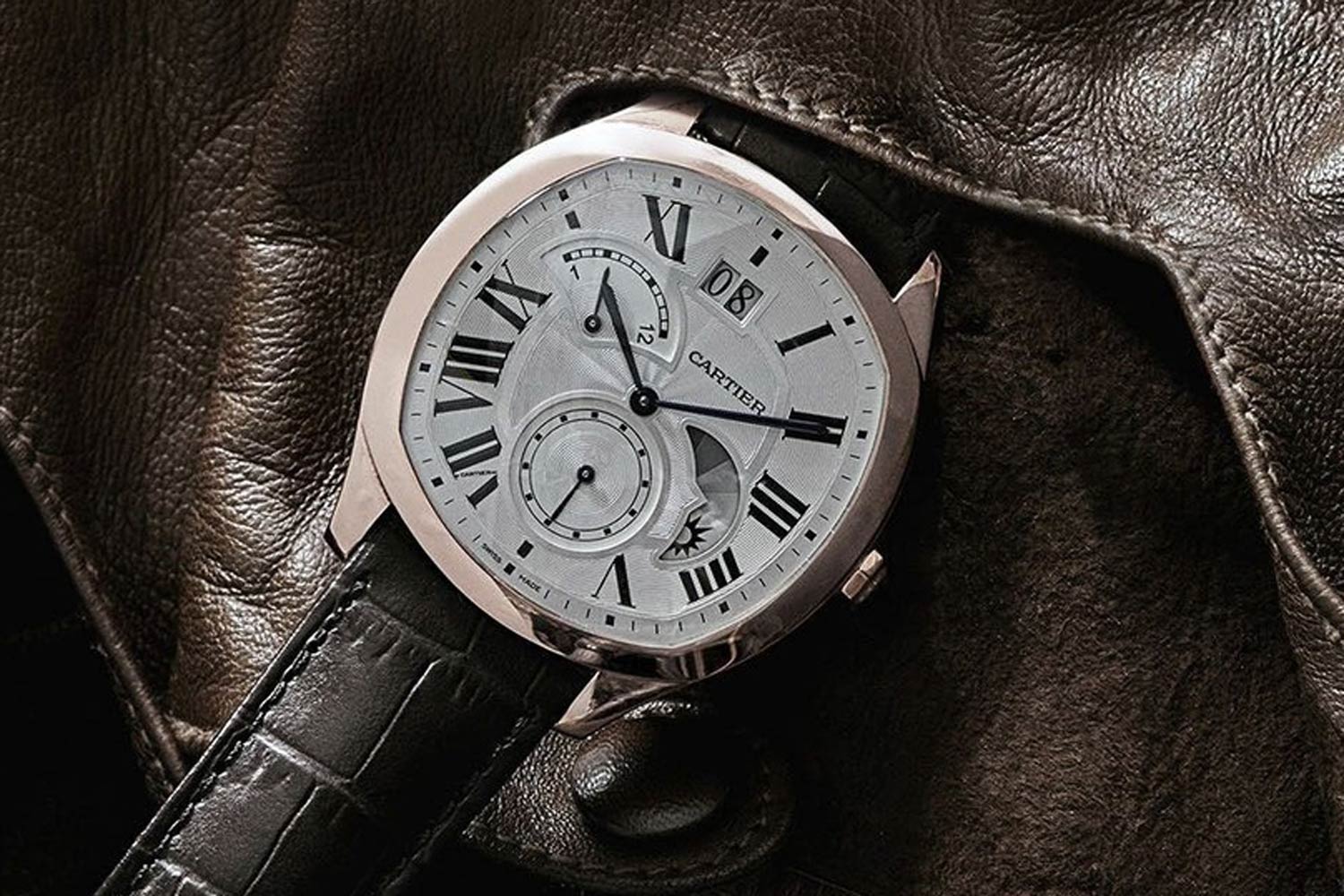
Drive De Cartier with Large Date, Retrograde Second Time Zone & Day/Night Indicator
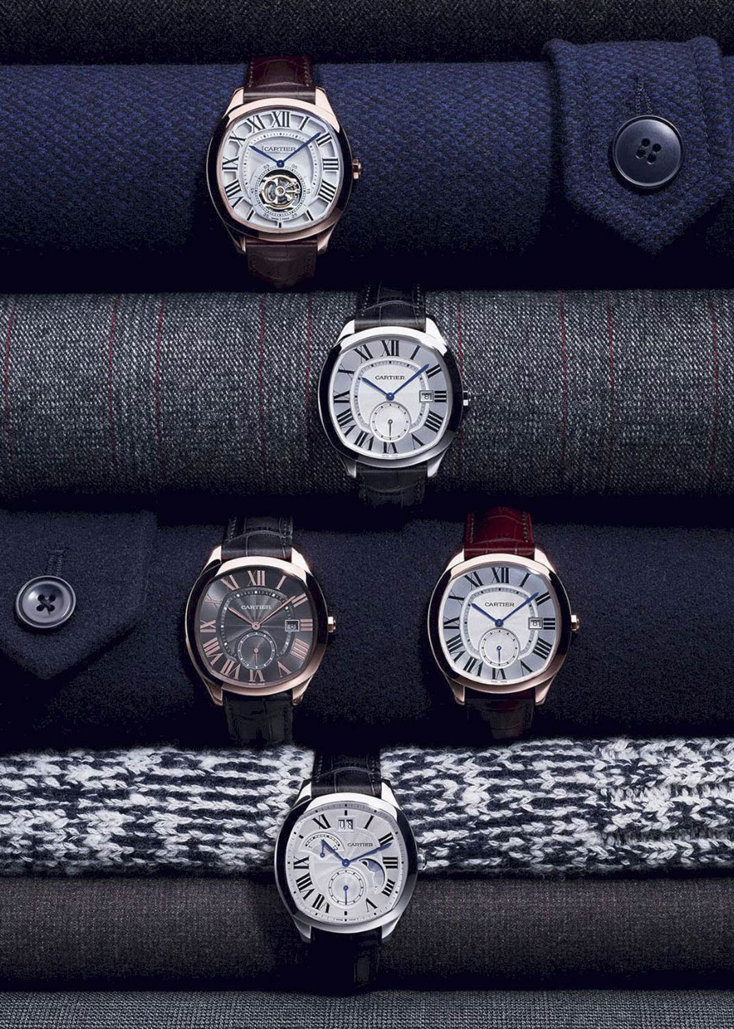
The Collection Drive de Cartier from 2016
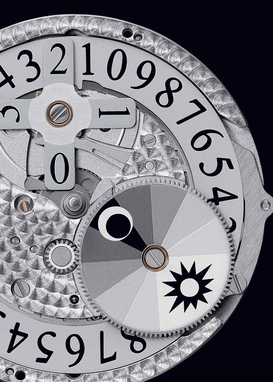
Drive de Cartier's caliber ref. 1904 PS-MC
Why did it stand out?
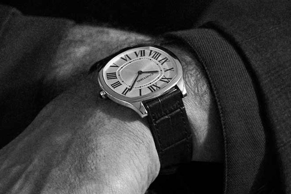
Eminently masculine looks aside, the Drive was a big deal. Not only was it backed up with a splashy marketing campaign featuring Jake Gyllenhall, but it was also a completely new collection for the Maison, a spiritual, automotive successor to the Roadster. Cartier plays comfortable rectangles — such as the Tank and the Santos — and has had phenomenal success with the round Ballon de Cartier. The Drive occupied a middle ground, with a cushion-shaped case that came in at 40mm, perfect for a men’s dress watch at the time. It was offered in a range of dial variants at release, with the time-and-date versions in steel or gold getting the most air time. There was a somewhat jumbled-looking number with a big date, second time zone and day/night indicator, as well as a flying tourbillon model.
The Drive occupied a middle ground, with a cushion-shaped case that came in at 40mm, perfect for a men's dress watch at the time. (Image: George Cramer)
What happened since then
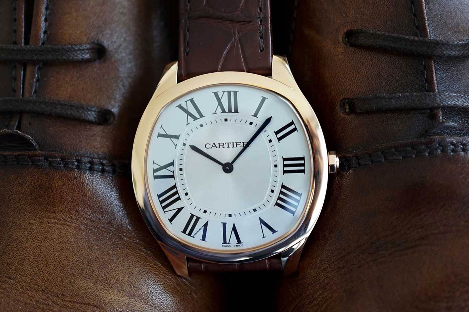
The Drive is still very much in Cartier’s collection. In the years after its release, the line received a few significant additions, namely a handsome and symmetrical moonphase, and the Extra Flat, initially launched in 2017. The Extra Flat simplifies the Drive a little, with a plainer dial and a slightly smaller case (39mm compared to 41), and brings the height down to 6.6mm, almost half that of the initial Drive. For my money, this is still the one to get, either in steel or in yellow gold.
The Extra-Flat Drive de Cartier launched in 2017
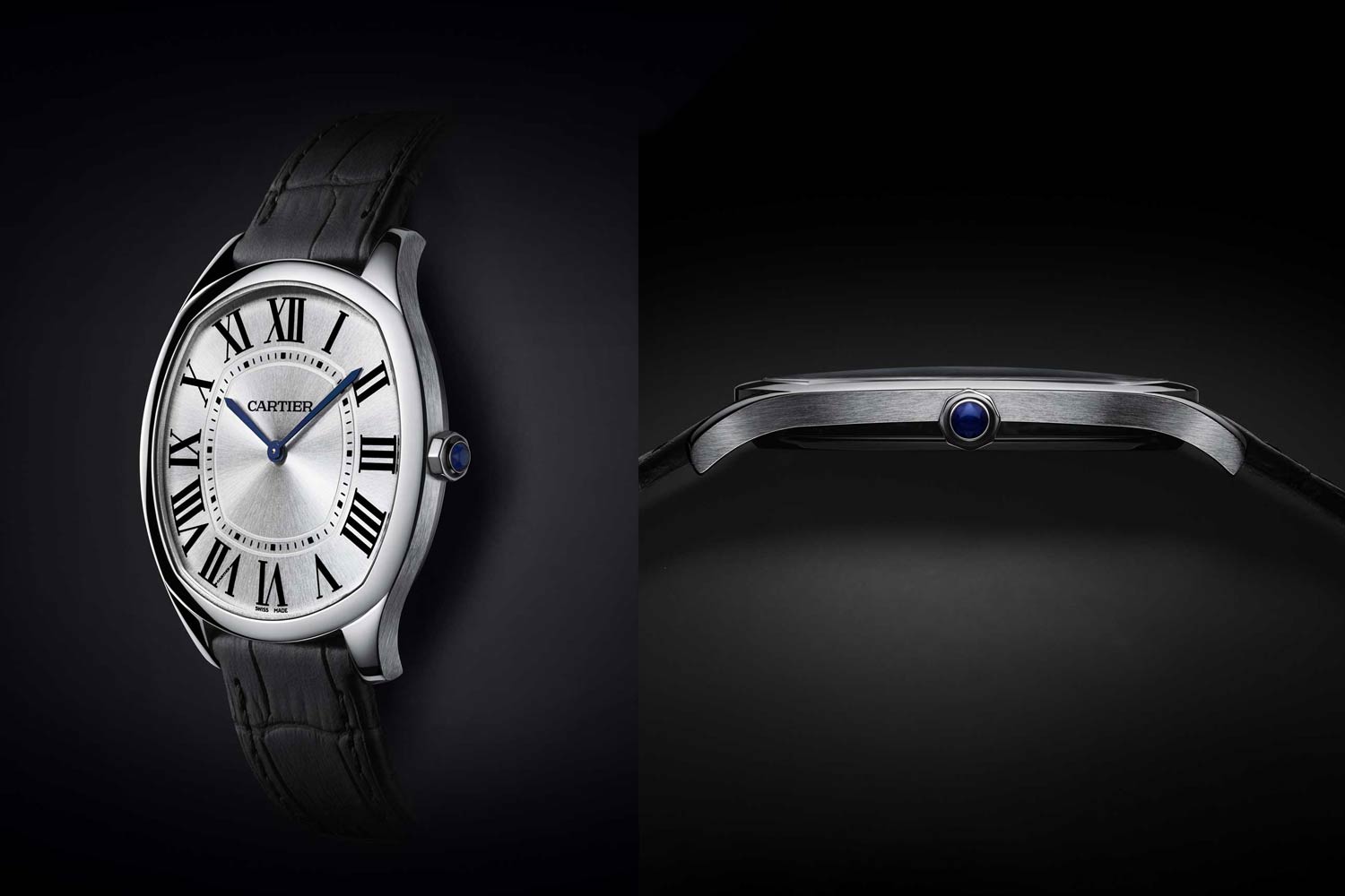
With a plainer dial and a slightly smaller case (39mm compared to 41), the Extra-Flat Drive de Cartier brought the watch’s height down to 6.6mm, almost half that of the initial Drive.
Why it doesn’t get the love it deserves
First things first, the Drive does a lot of things right. Cartier, perhaps more than any other brand, has to be exceptionally careful introducing a new case shape to the family. And the Drive did this really well. The shape is complex and compelling, with those swelling flanks synergise exceptionally well with the dial design. Fundamentally it’s a great design. It loses some of its charm in more complex iterations, but that can be said for many (if not most) watch designs.
The real challenge the Drive faced was one of positioning, and it was a challenge Cartier walked into with wide-open eyes. As watch collectors or enthusiasts, it’s sometimes easy to forget the scale and scope of a brand like Cartier. The Maison is primarily a jeweller that leans on heritage and skews more heavily towards women than men. As such, a new watch collection aimed squarely at men was somewhat outside of the brand’s comfort zone. This positioning certainly wasn’t accidental, as the Drive would have been intended to bring new men to the brand. The choice of shape was also a brave one too — it’s quite close to a round watch, which obviously has mass appeal, but a lot of competitors. If you’re looking for a dressy rectangular watch, Cartier is pretty much at the top of a very short list, but change that shape to something more circular, and it’s an exponentially more crowded field.
The real challenge the Drive faced was one of positioning, and it was a challenge Cartier walked into with wide-open eyes.
What we’d change
Sure, in an ideal world — one where we have total control over the design and implementation of Cartier’s watchmaking product — there are a few minor changes we could make. Tweak a date window here or a dial treatment there, but fundamentally the Drive de Cartier is a great watch. For the Drive to thrive, in the short term it needs oxygen in the form of active marketing support. The other thing the Drive needs is time. Time to find its feet, and to find a fan-base. It will never be a watch to outshine the Santos or the Tank Louis Cartier, but that doesn’t mean that this handsome men’s model doesn’t deserve a space in the brand’s catalogue.
Forgotten Heroes — Cartier's Drive de Cartier (Image: George Cramer)